Client
Taco Loco - Taco Trucks
My Role
UX / UI Lead - Designing a mobile food ordering app for Taco Loco from conception to product delivery.
Project Duration
August - October 2023
Skills
User Research, User Personas, Competitive Audits, Customer Surveys, Wireframing, Logo Design, Prototyping, Usability Studies, Refinement and Product Mock Ups
Taco Loco is a local taco truck business that has mobile food trucks scattered around Melbourne city. Taco loco attracts waves of city workers, commuters and food enthusiasts with their on-the-go fresh Mexican dishes and community feel.
This is case study project was created during a Google UX Design Academy Course.

A small group of customers were asked the same list of questions to further understand their pain points when ordering food. The findings from the customer interviews lead to the creation of two user personas, the personas represent a diverse range of customers and highlight common frustrations.

This user group confirmed initial assumptions made. However, the research also concluded that it wasn’t just long order queues and orders issues. There is a language barrier issue and more images of the products would drastically improve the experience.
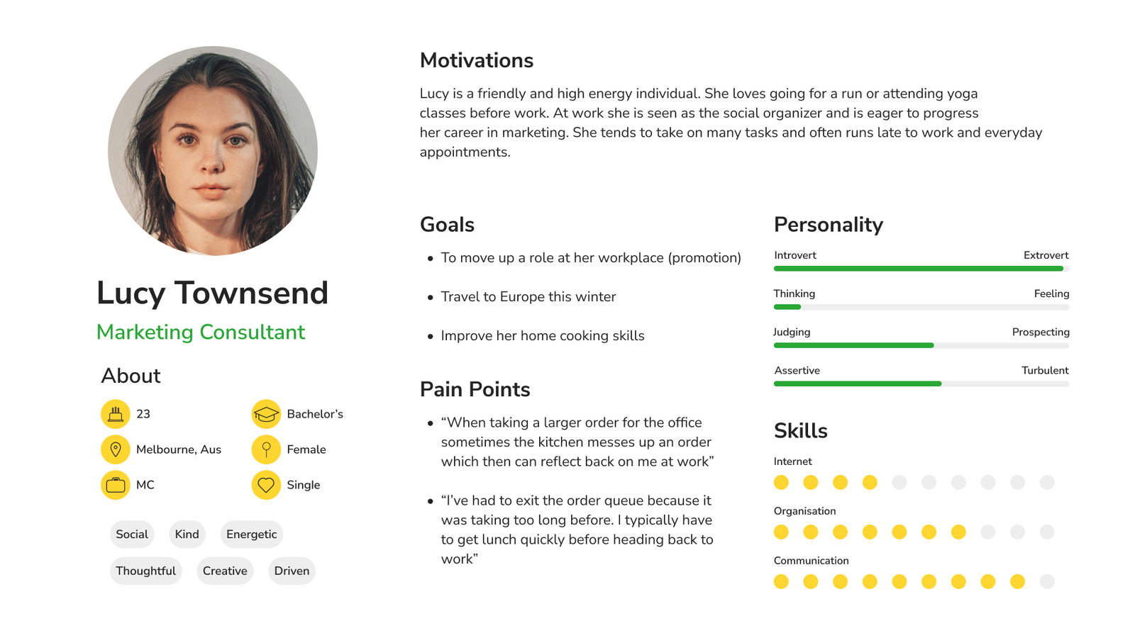
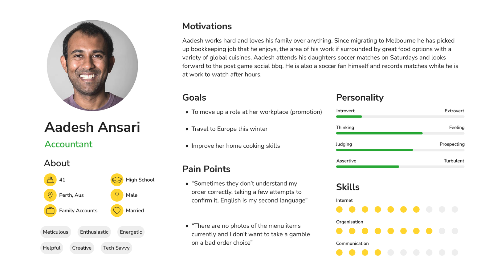
Customers can be deterred from ordering due to long wait times or errors with group orders.
Improve accuracy of group orders and ordering efficiency, primarily the waiting time.

Big picture storyboarding is utilised to further empathize with the user and look for improvements at all interaction points along the journey.
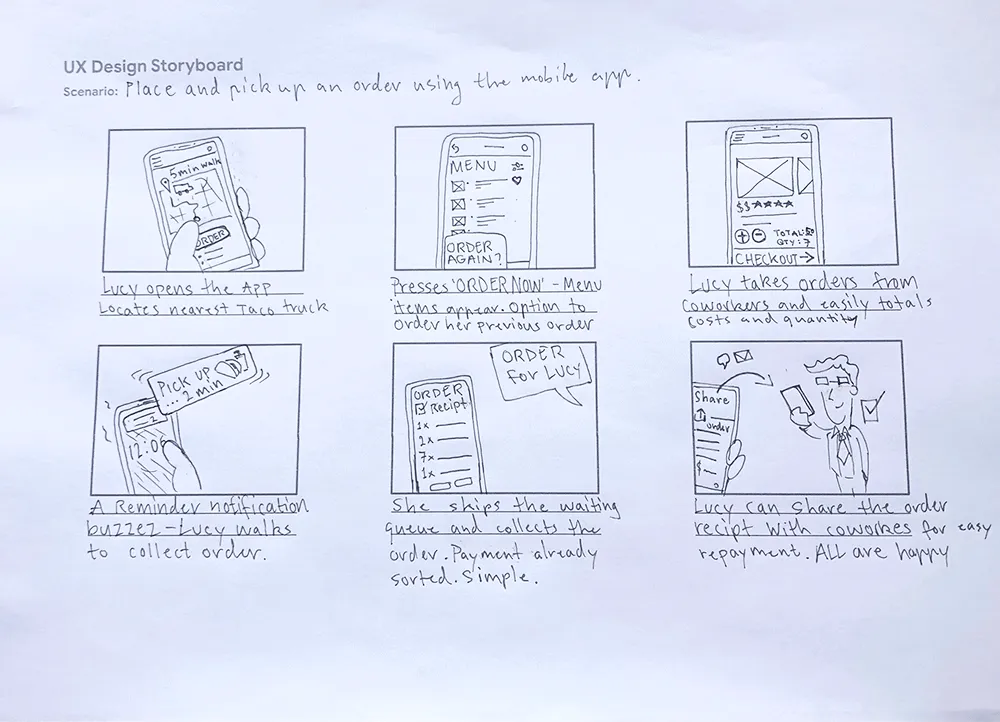
A small picture storyboard is also sketched to observe the situation solely from the direct user and product perspective.
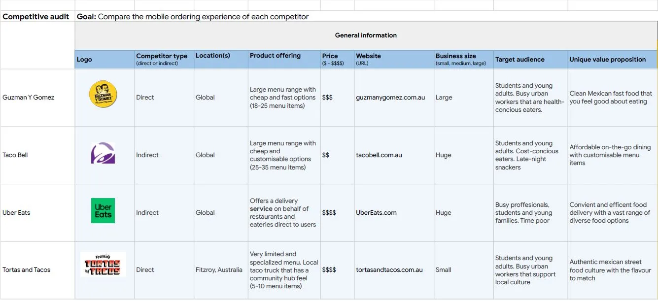
A competitive audit was conducted to compare the mobile ordering experience of existing products whilst gaining insights on how to innovate and improve on my own designs. The UI and UX of competitor companies were evaluated in detail, below is a snippet of the large table matrix used.

Users experience long waiting times and queues when ordering. The design will aim to reduce order wait times for customers by creating a mobile ordering system. Pre-ordering is enabled and a QR code to install the app present on site.

Order issues - incorrect or missing items, especially with larger orders. The order errors will be mitigated by reducing human error in the process. Automating the orders straight to a kitchen order docket.

Customers that do not speak or read English fluently can struggle being understood and interpreting the menu. A menu translation feature will mitigate this language issue.

The taco truck currently has a written menu list with limited images of the order items. Adding quality imagery for all menu items will aid customers decision and encourage additional and alternative purchasing overall.

Now that the user, their goals and pain points are defined the design process begins!
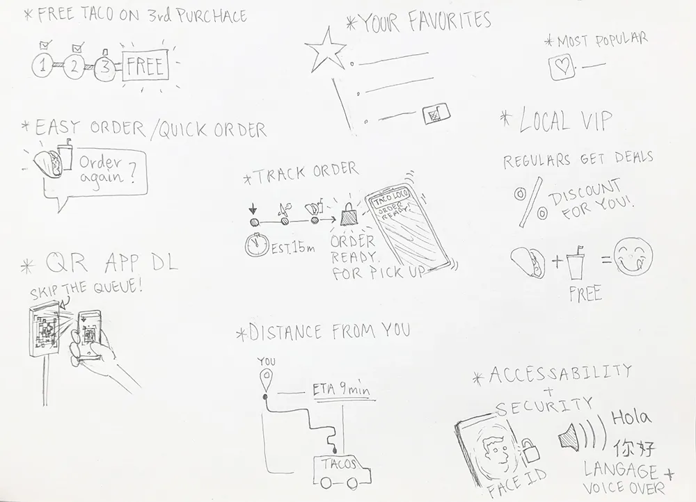
Rapid sketching on paper with a focus on quantity and variety of ideas. This exercise encourages unique ideas that can provide great starting points for a potential design solution.
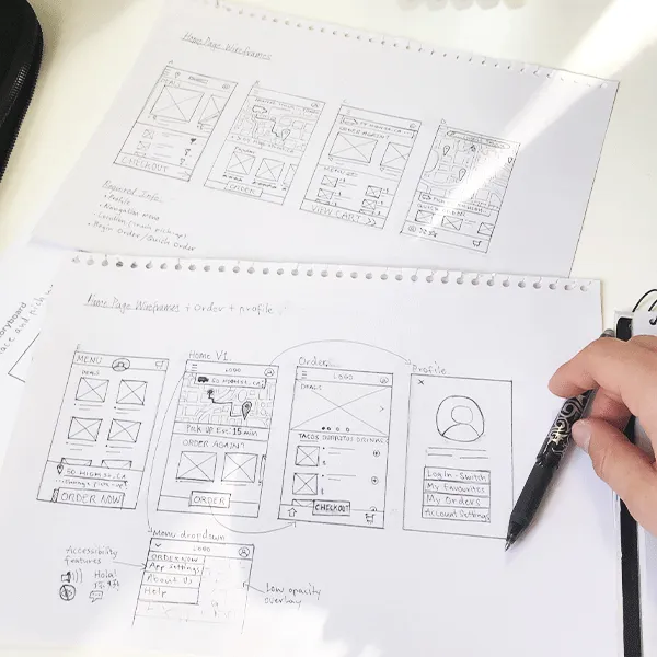
Iterations of paper wireframes were created for each screen of the app to ensure the layout addressed the users common pain points whilst prioritising usability and aesthetic UI elements. For example a consistent large ‘ORDER’ button has been implemented to optimise the ordering process from the Home Screen all the way to the final Order Status Screen.
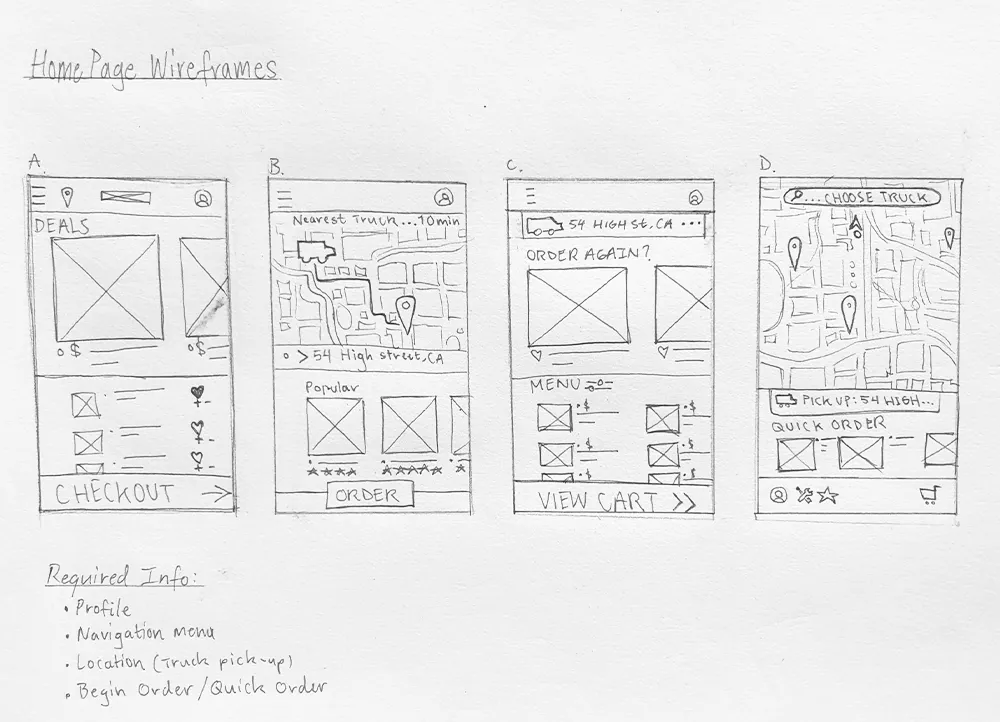
Up to eight different screen and layout designs were drafted before a final UI was selected. The sketches below show some of the iterations sketched for the home screen design.
The primary user flow - Placing an order using the mobile app


Refined wireframe sketches are placed into Figma for reference when creating digital wireframes.
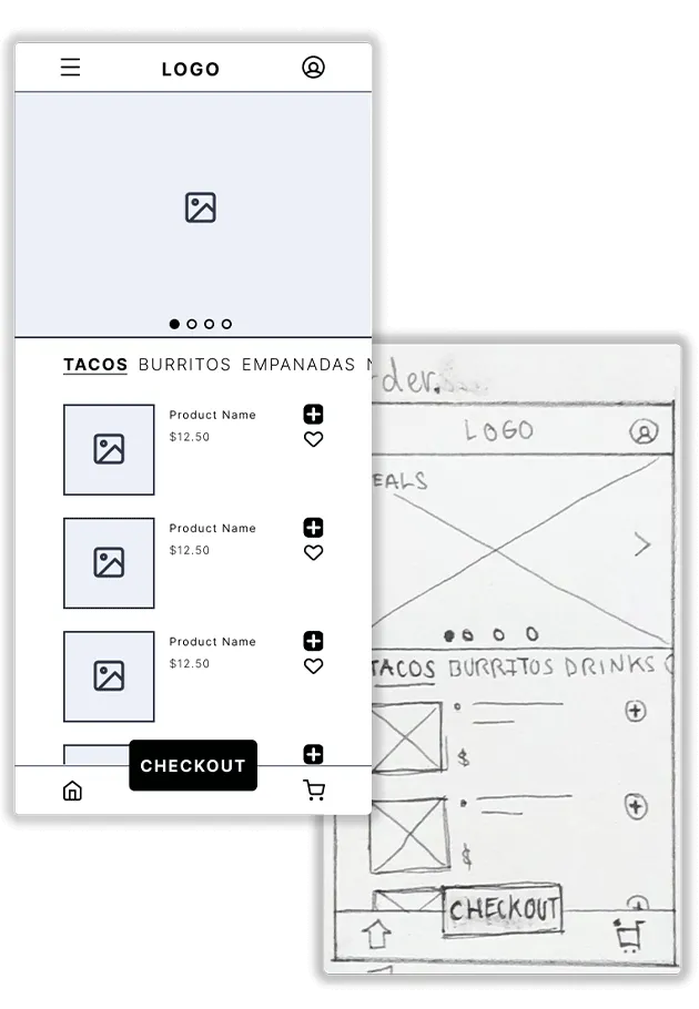
Small adjustments and spacing enhancements are added to better suit the desired mobile screen size (390 x 844px).
Digital wireframes organised into a user flow for placing an order using the mobile app.
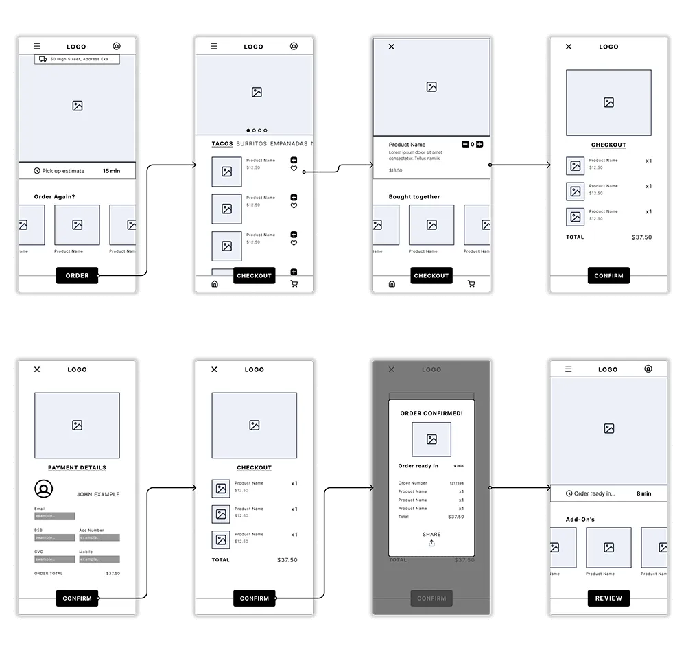

Interaction testing and running through adding selecting and adding an item to cart.
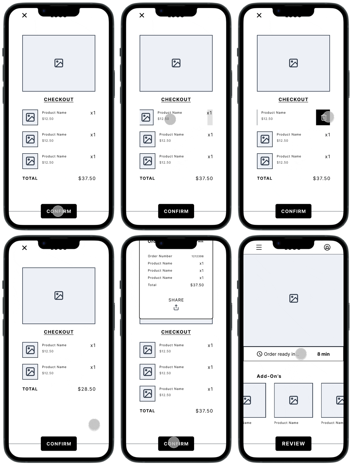
Testing the checkout and order completion process. Feature exploration such as, slide to remove an item from cart.
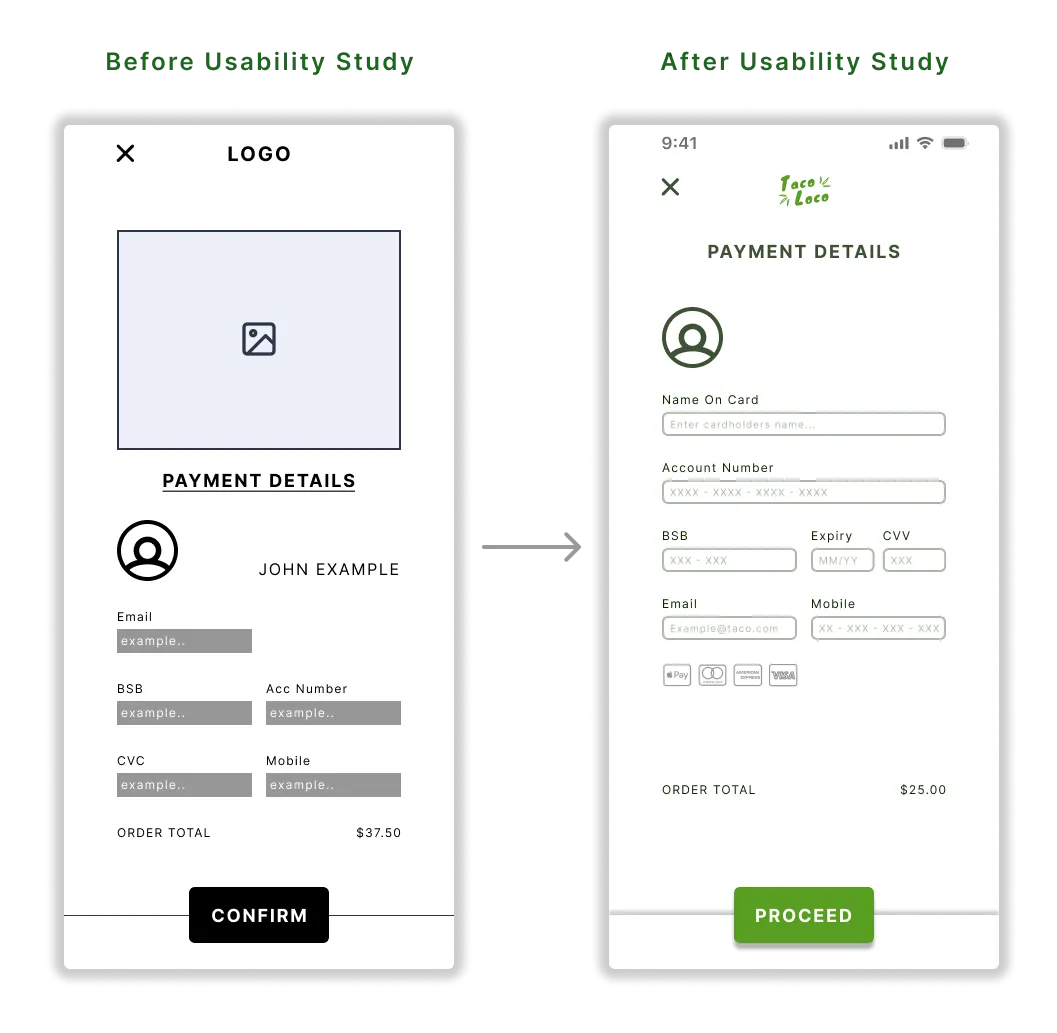
The lo-fi prototype was sent to five participants along with a set of tasks to complete within the product. After two rounds of usability studies were conducted sufficient data could be synthesized and used to further improve the designs.

Users want to be able to undo and updates orders from all checkout screens

Some users required accessibility features such as a screen reader or language aid

Users felt the layout of the payment and details screen to be hard to read and navigate
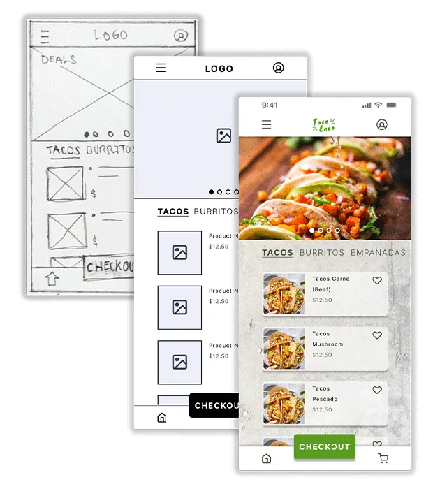
The results from the usability study are then implemented into the design. At this stage branding and colours are also implemented.

The logo was designed to be legible and optimal for mobile, whilst connecting the brand identity of Taco Loco. Fresh food, community and tradition.
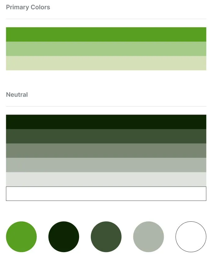
A colour palette of primary, accent and neutral colours was selected and created into styles within Figma for uniformity and brand guidelines. Font families were also created into styles for the design system.
Colour, branding and imagery added to the prototypes ready for users to test and experience the product without guidance.
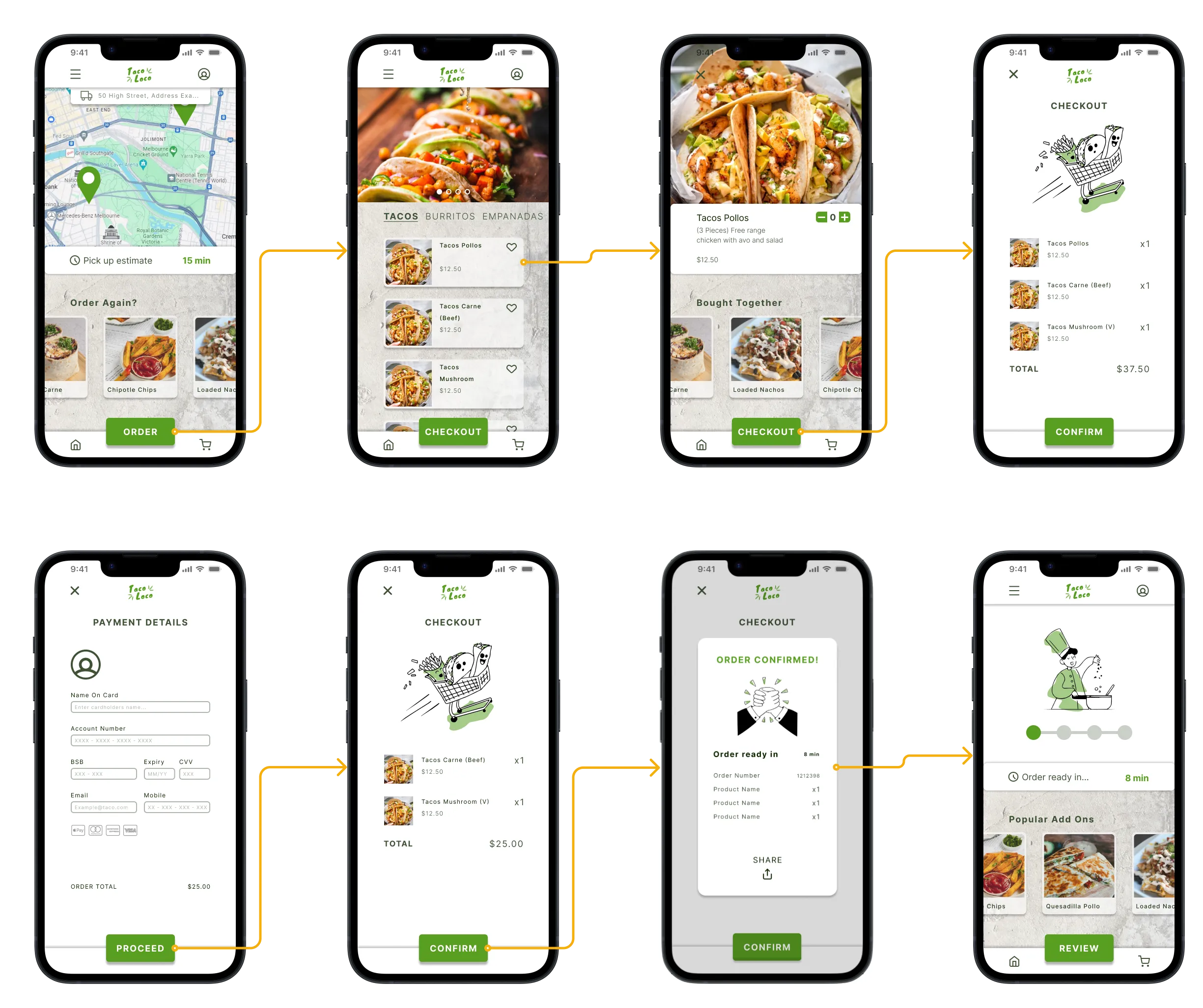

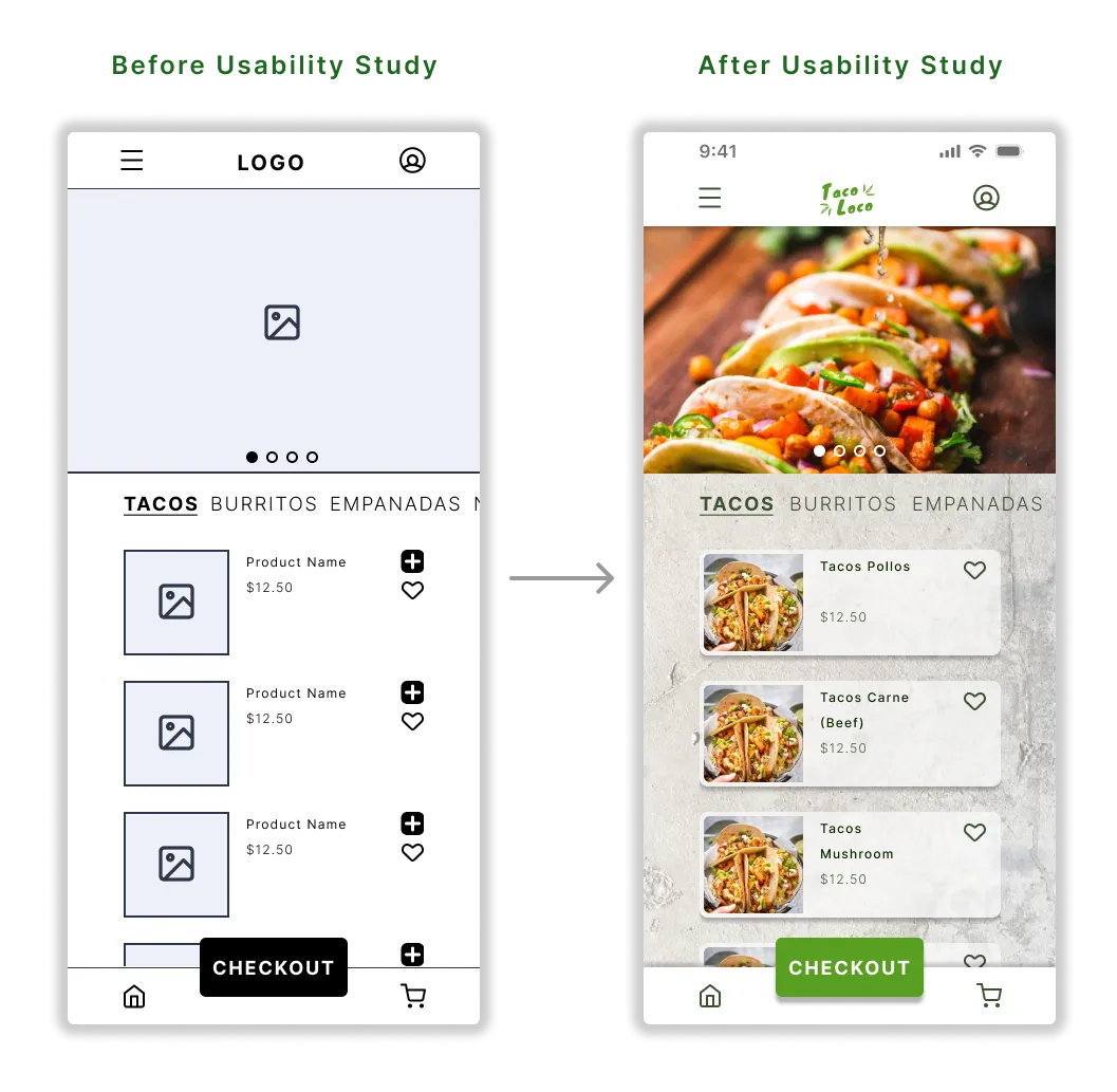
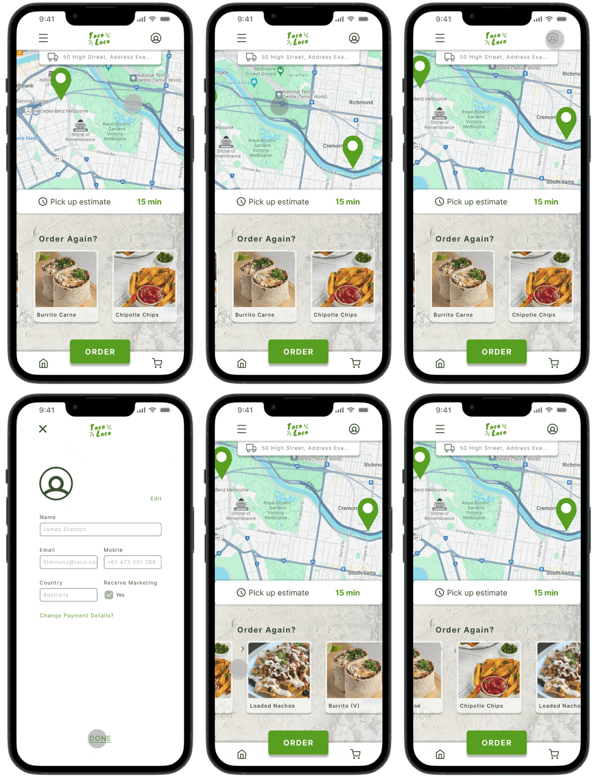
Home and Profile screen interactions. The taco truck location finder map saves the customers time on locating nearest food truck.

Adding an item to cart. Order menu and product detail screens explored.
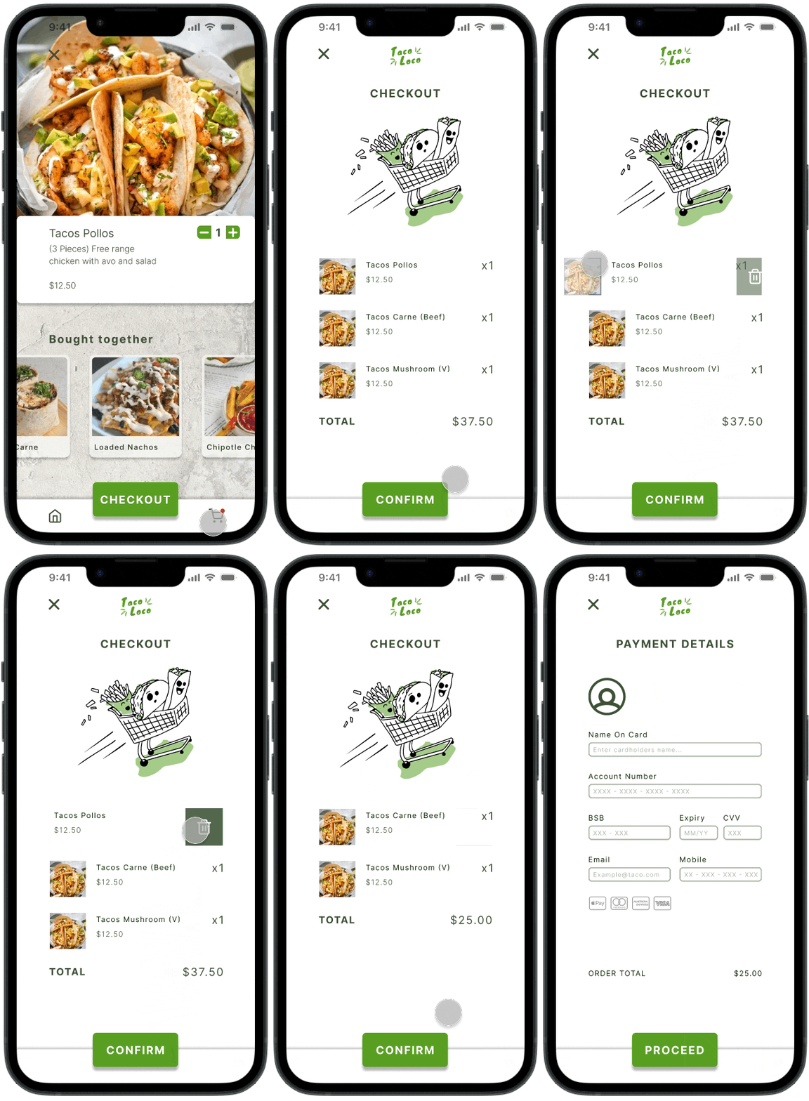
Cart list with itemised costing and quantities to further reduce order errors. Easy slide to remove from cart feature.
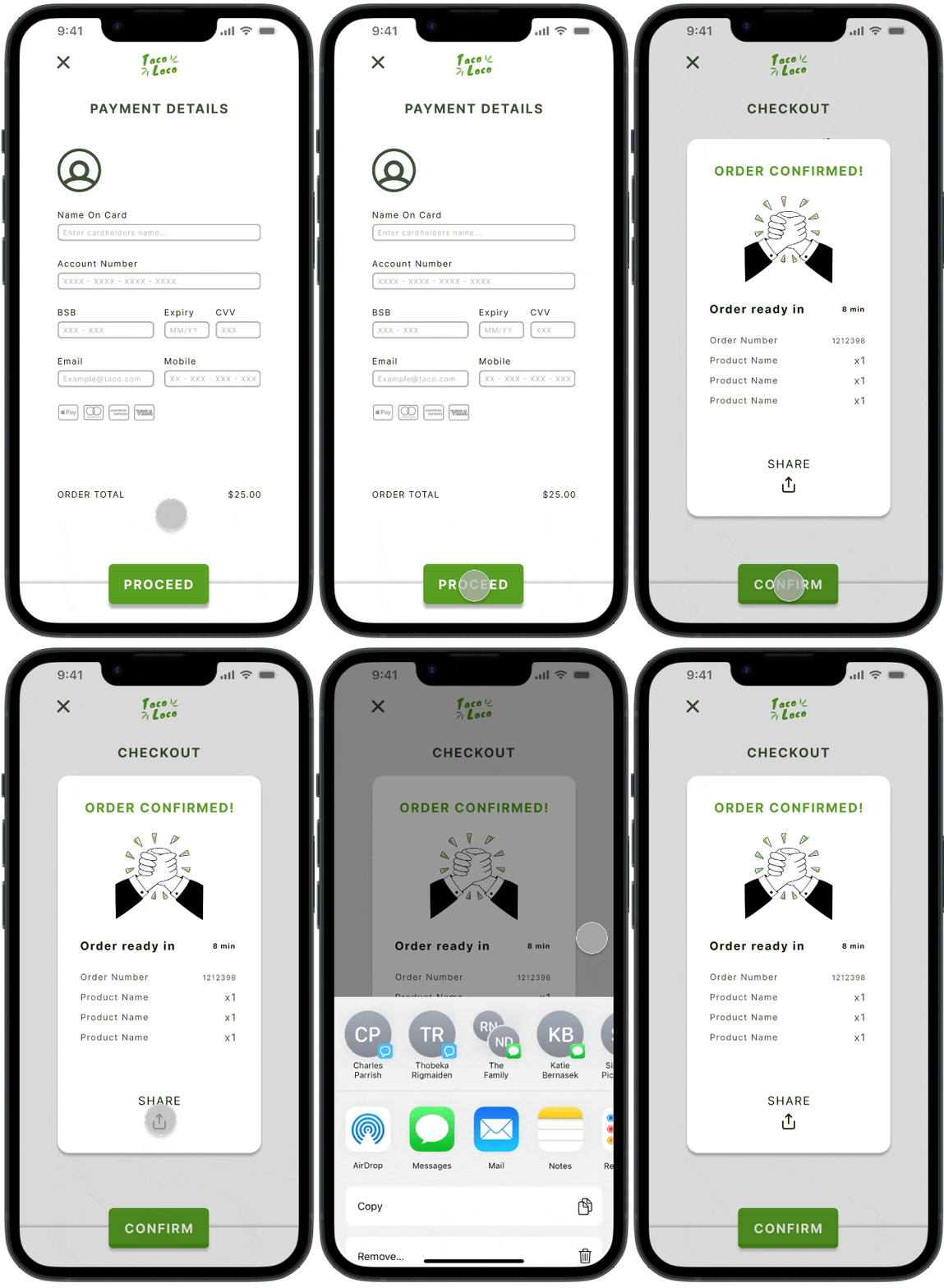
Share your order with friends so they can see the itemised cost and view the order status.
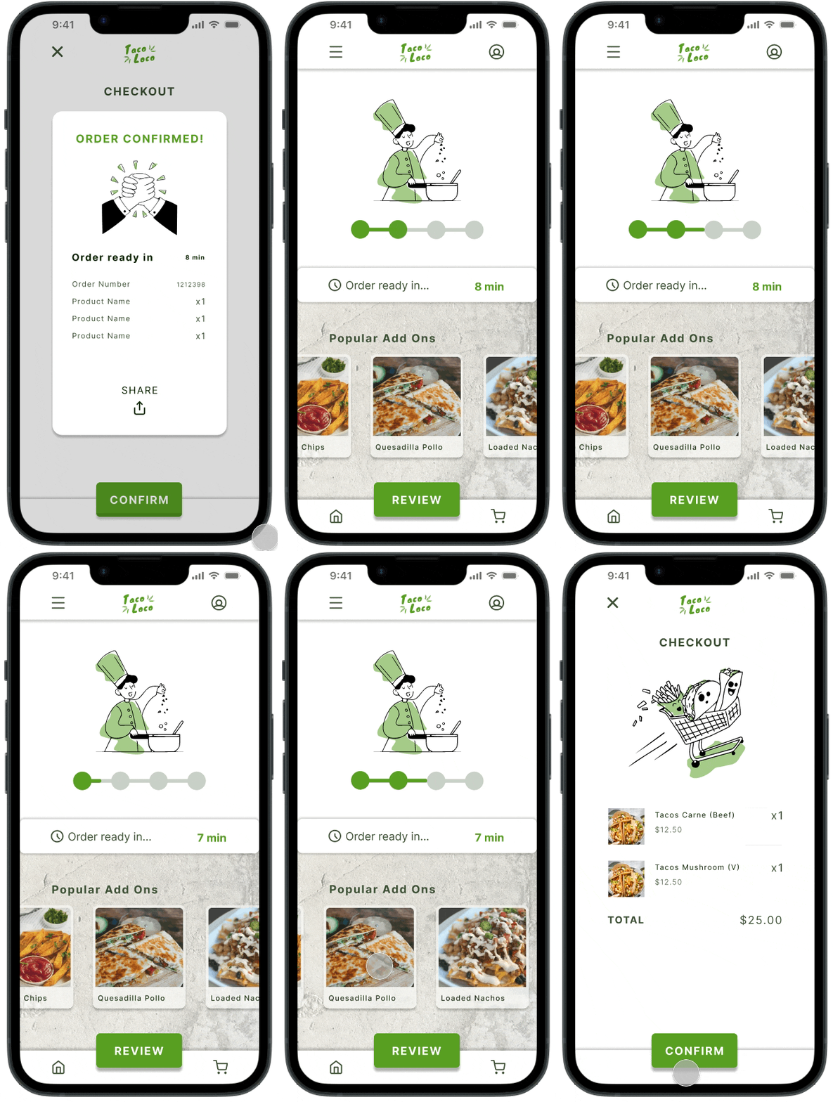
Order status animated screen and review order feature.
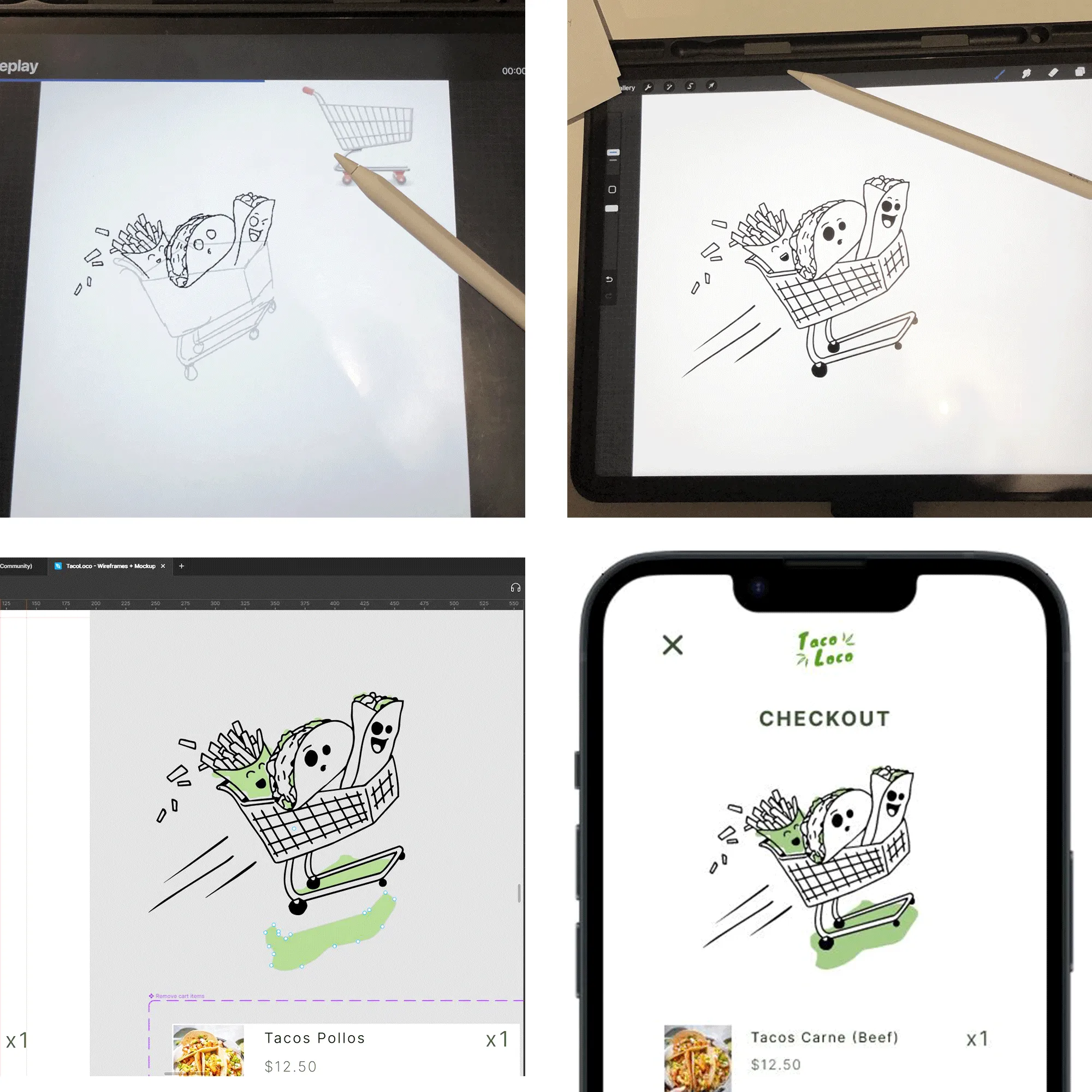
I create my own graphics and illustrations when stock assets aren't suitable. This makes my work truly unique, this also makes it easy to maintain consistency on all illustrations throughout the product.


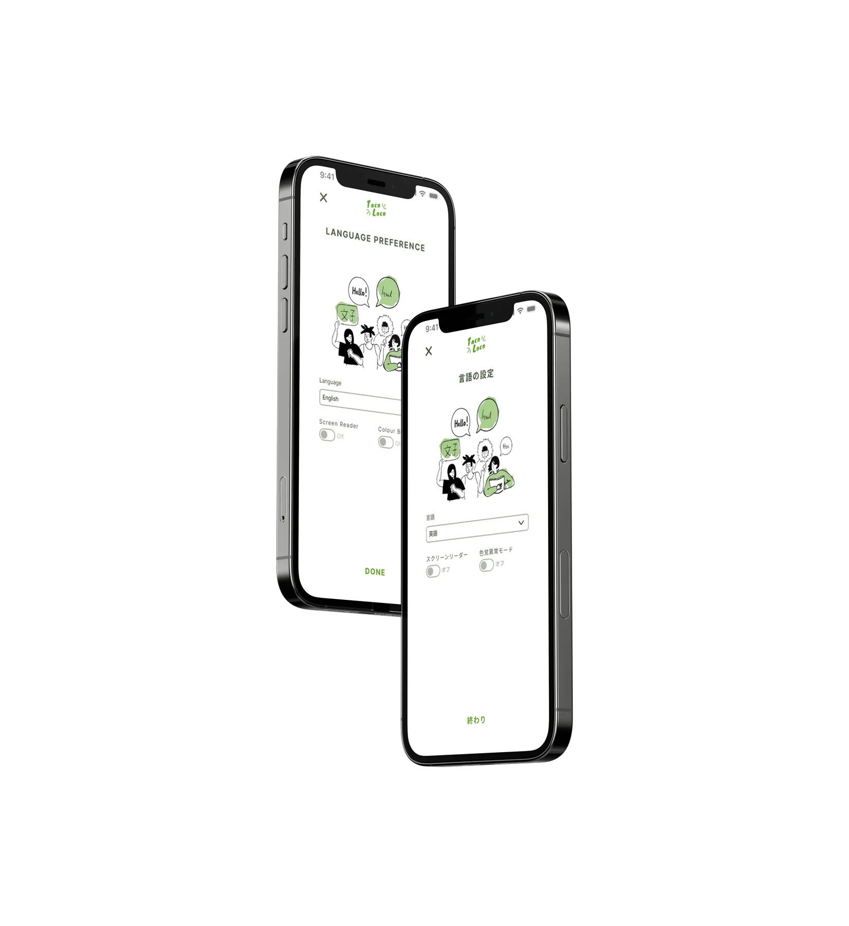
Easily change the language within the app from the primary menu

Iconography, imagery and numbers are used as frequently as possible to ensure each feature and screen is legible for users of all abilities and backgrounds

Screen reader and colour blind modes have been included to assist users of need

Prototype showing the language selection and other accessibility considerations such as a screen reader and colour blind mode.
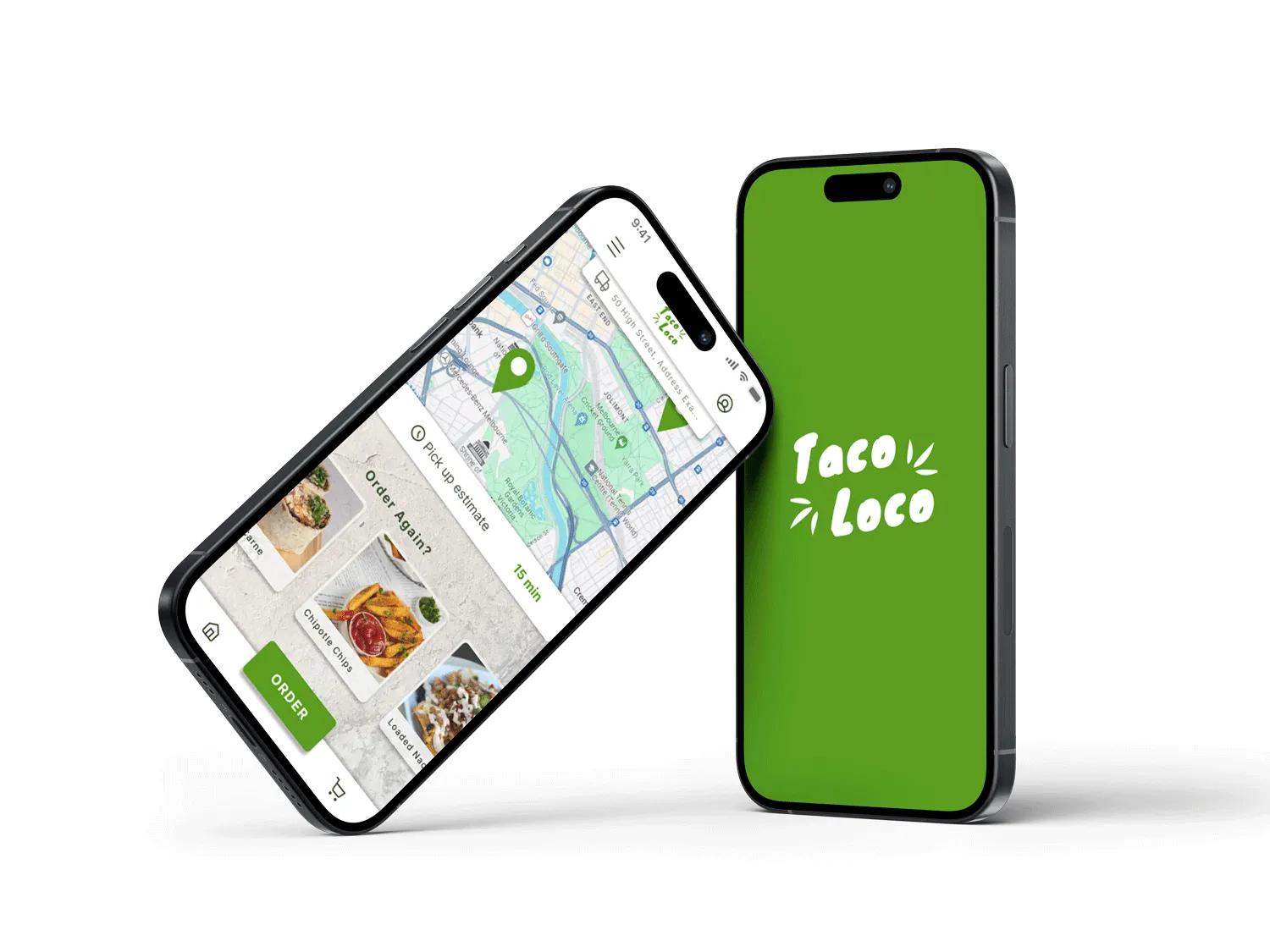
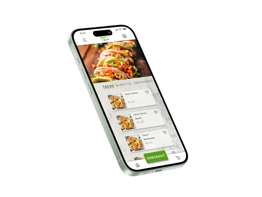
The new app has drastically improved the customer experience and business at Taco Loco. Customers can now pre-order and view waiting times allowing efficient collection of their orders with fewer order mistakes.
“The app has meant I can order before my lunch break then collect it without wasting any time in the ordering line - I highly recommend this app!”

I appreciate the time taken to look through my work. If you want to get in contact hit the 'SAY HI' button below.