Client
Nuex - Museum of Modern Art.
My Role
UX / UI Lead - Designing a dedicated mobile for Nuex Museum of Modern Art from conception to product delivery.
Project Duration
December 2023 - January 2024.
Skills
User Research, User Journey Maps, Wireframing, Logo Design, Prototyping, Usability Studies, Refinement and Product Mock Ups.

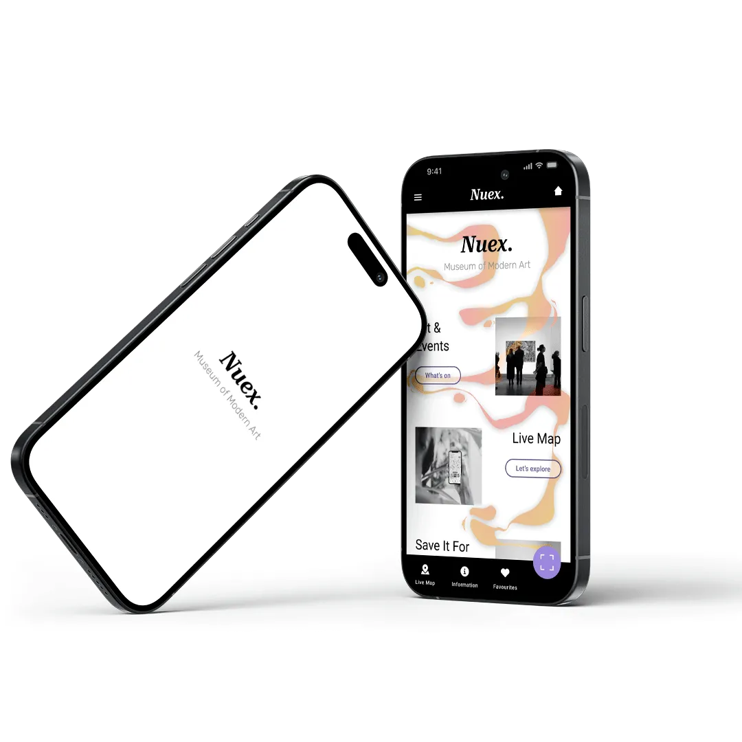
Nuex - Museum of Modern Art is a popular gallery based in London. The dedicated mobile app improves the way patrons navigate and experience the exhibitions. The product improves accessibility and overcrowding issues, whilst providing more information to patrons on exhibits, artists and upcoming events.
This is case study project was created during a Google UX Design Academy Course.
A group of art museum patrons were asked the same list of questions to further understand their pain points when visiting and exploring the exhibition. The findings from the customer interviews lead to the creation of user personas, the personas represent a diverse range of customers and highlights common frustrations.
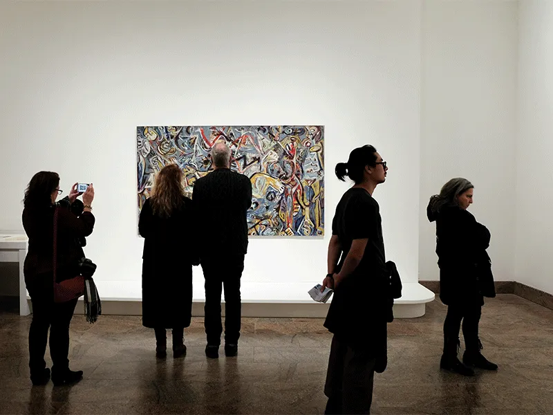
This user group confirmed initial assumptions made. However, the research also concluded that it wasn’t just lack of information issues. There is a need for improved wayfinding and navigation throughout the art museum with emphasis on accessibility.

Museum patrons would like more information about artists and their exhibits. Museum navigation can also be difficult due to poorly designed wayfinding systems, accessibility and overcrowding.
To improve museum accessibility and navigation, whilst providing more information about the exhibits and crowd levels / space capacity

Insufficient information about artworks, artists, and exhibitions may leave patrons feeling disconnected and uninformed during their visit.

Inaccessible facilities, lack of ramps or elevators, and inadequate signage can create challenges for patrons with disabilities.

Poorly designed wayfinding signage and floor layout can make it difficult for patrons to navigate through the museum and find specific exhibits.

Overcrowded galleries and exhibition spaces can lead to discomfort, difficulty in viewing artworks, and a less enjoyable experience.

Now that the user, their goals and pain points are defined the design process begins!
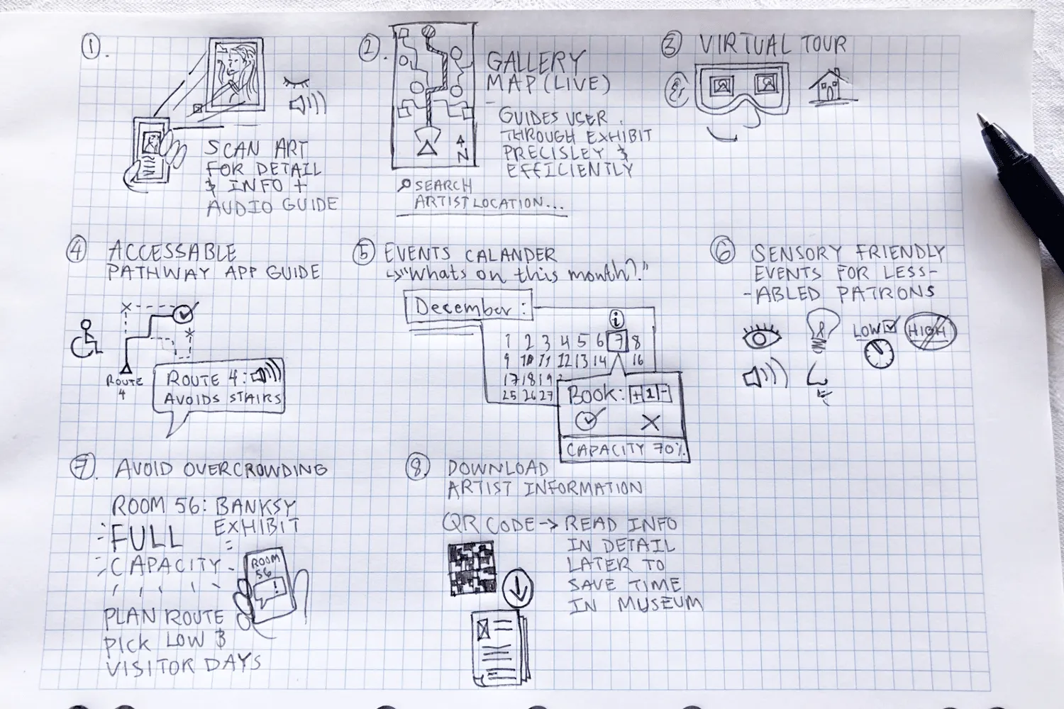
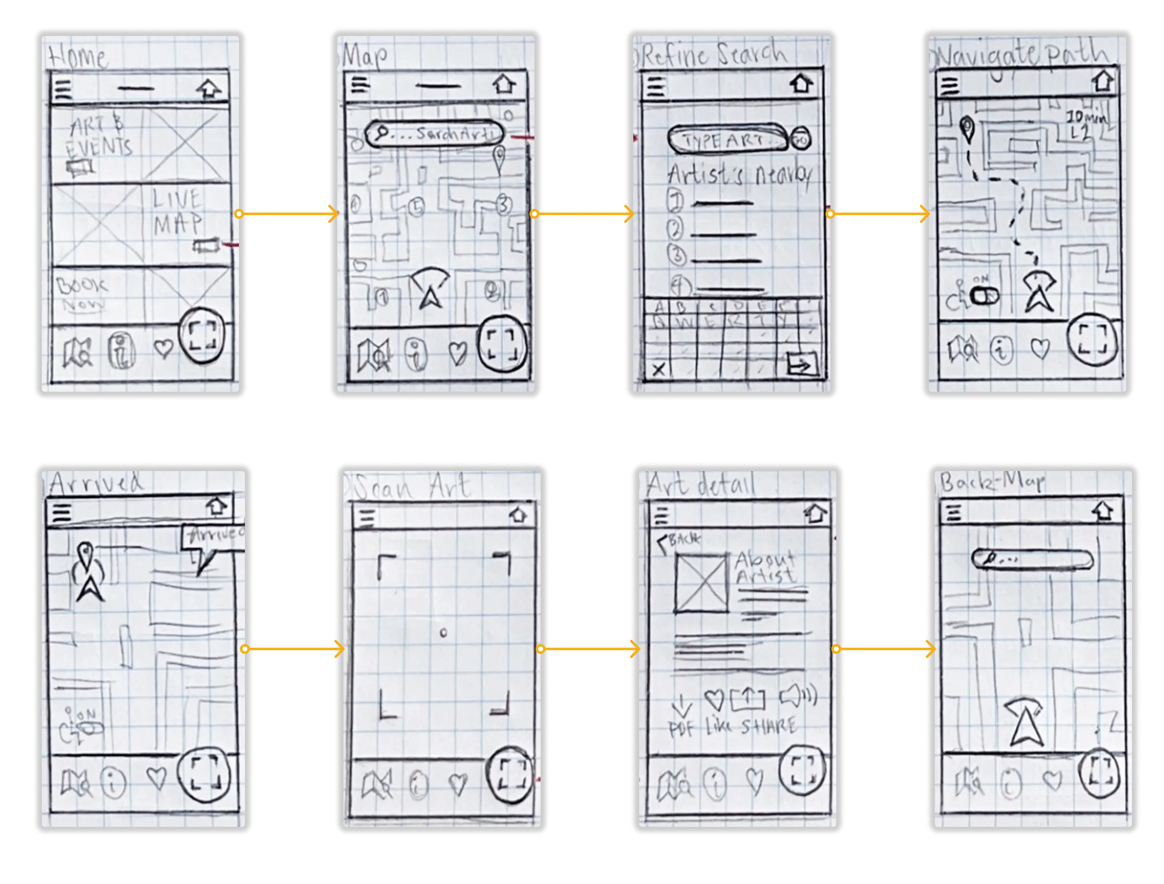
Rapid sketching on paper with a focus on quantity and variety of ideas. This exercise encourages unique ideas that can provide great starting points for a potential design solution.
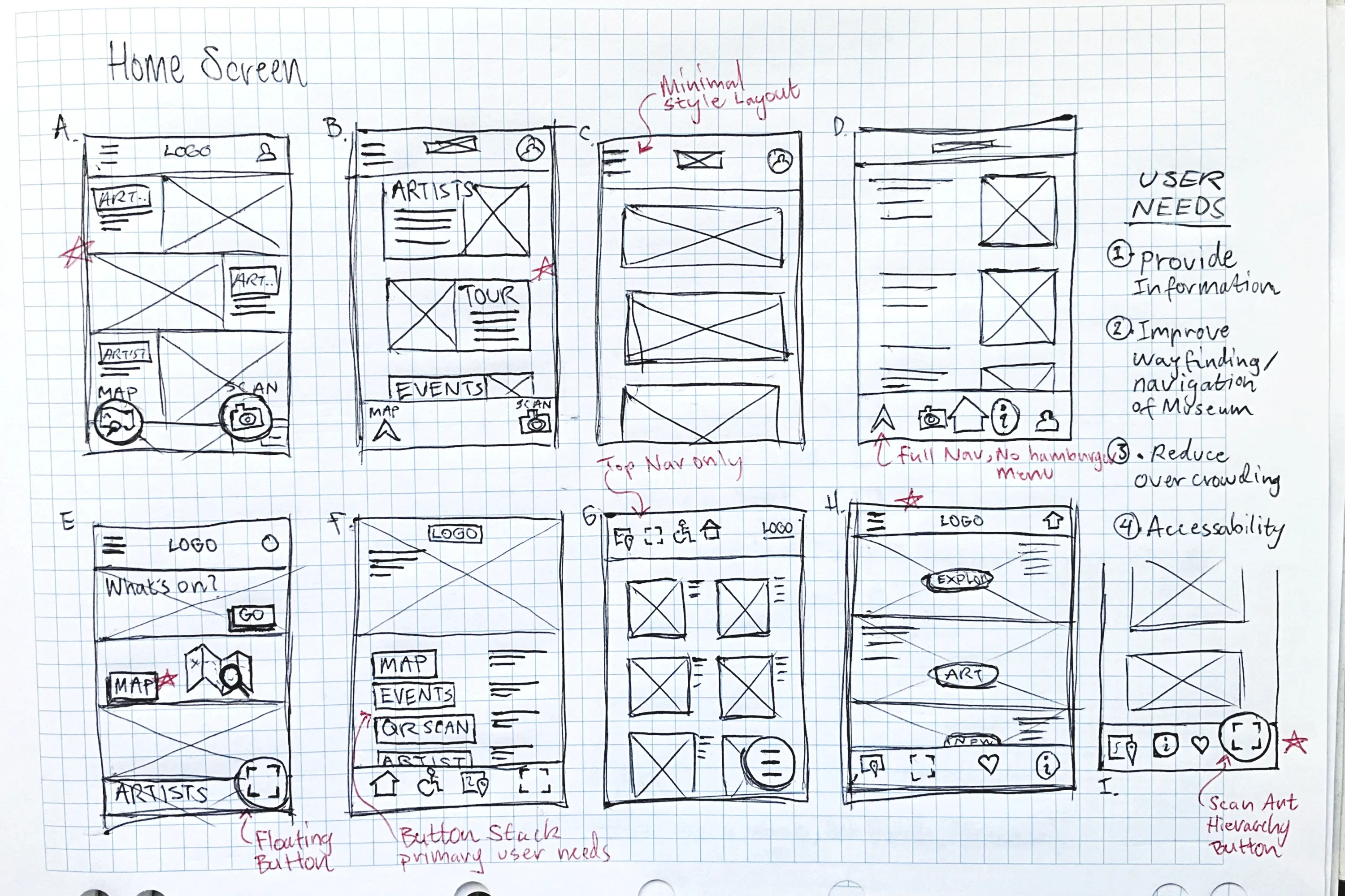
Iterations of paper wireframes were created for each screen of the app to ensure the layout addressed the users common pain points. Up to eight different screen and layout designs were drafted before a final UI was selected. The sketches below show some of the iterations sketched for the home screen design.
The primary user flow - Map navigation and searching for an artist or exhibition.
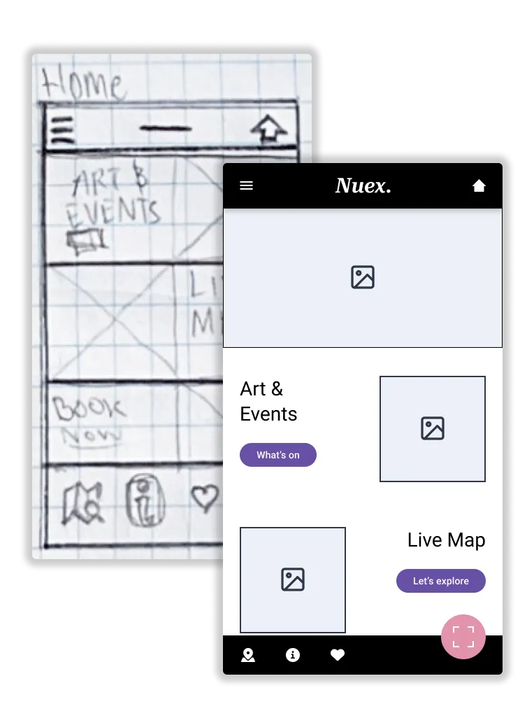
Refined wireframe sketches are placed into Figma for reference when creating digital wireframes. The material design 3 kit for was utilised in this design.
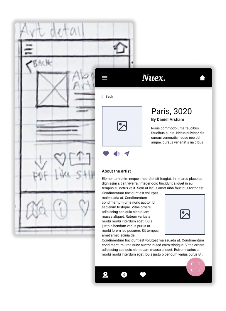
Small adjustments and spacing enhancements are added to better suit the desired mobile screen size (393 x 852px).
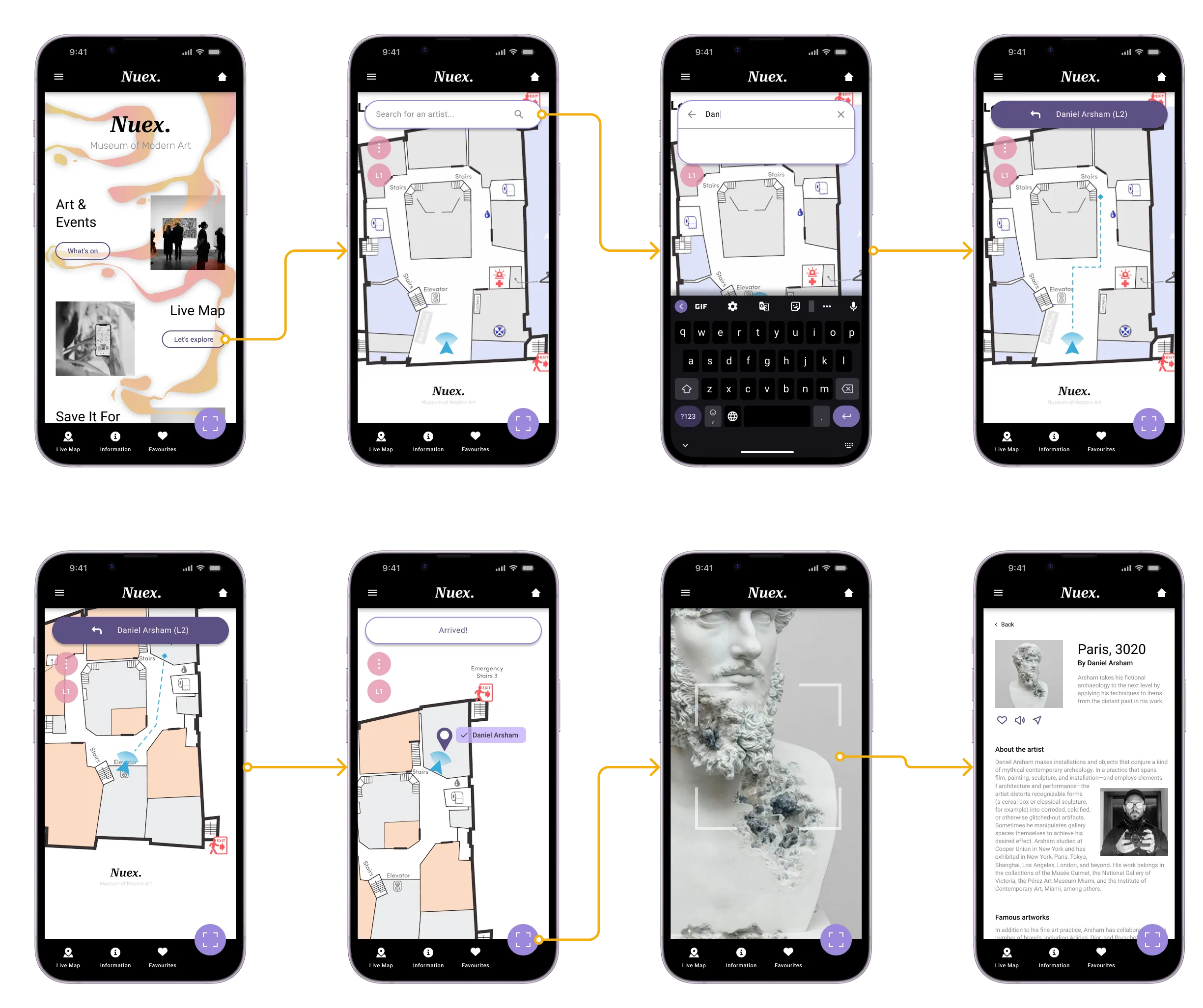
Digital wireframes organised into a user flow for using the map feature to find a searched artwork.

Interaction testing and exploring the map navigation feature for finding artists within the museum.
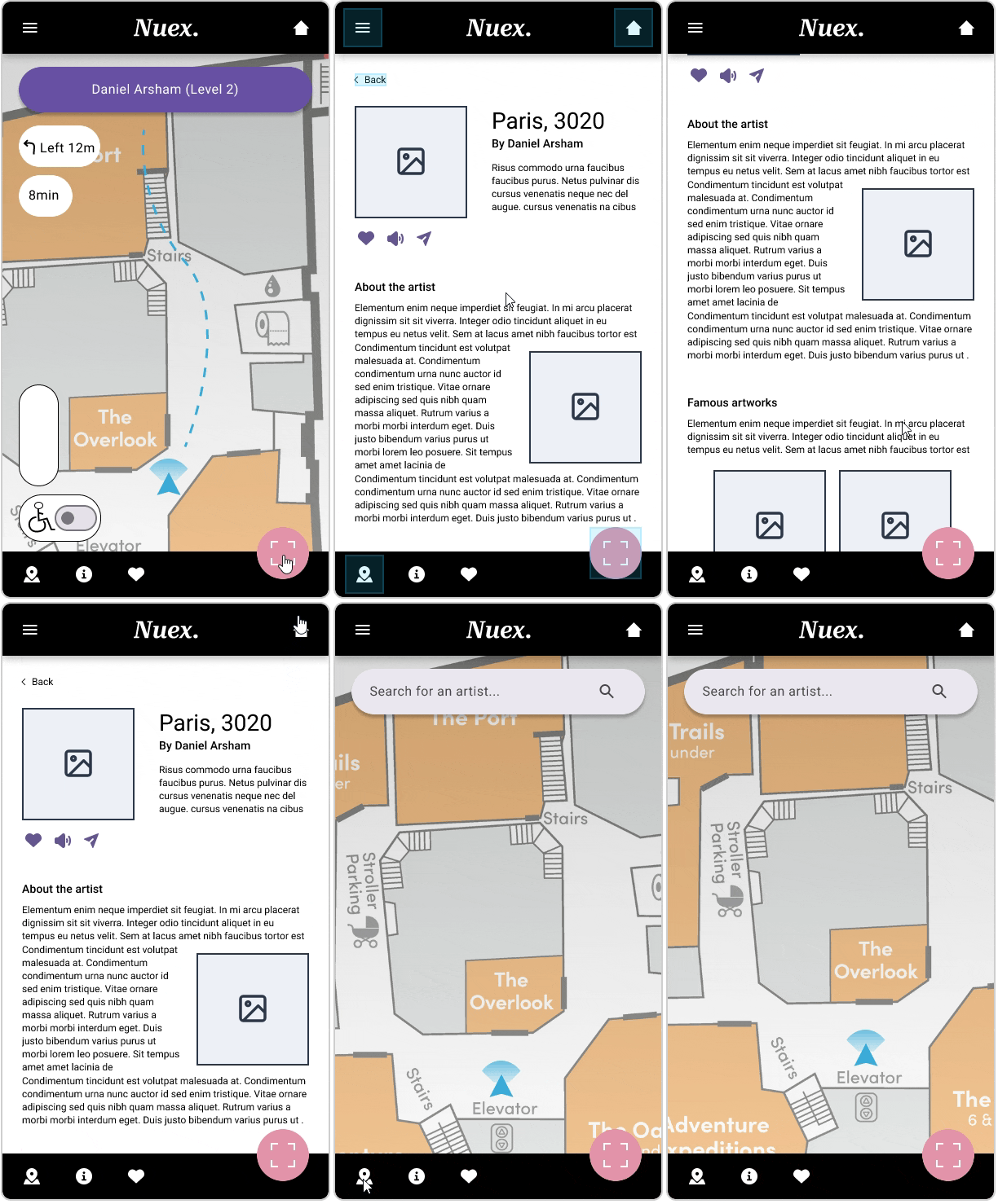
Testing the artist detail screen and the smoothness of the pop-ups and general navigation.
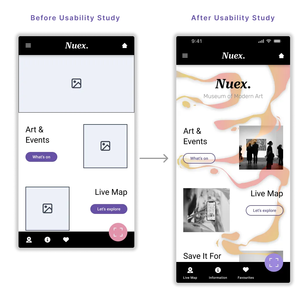
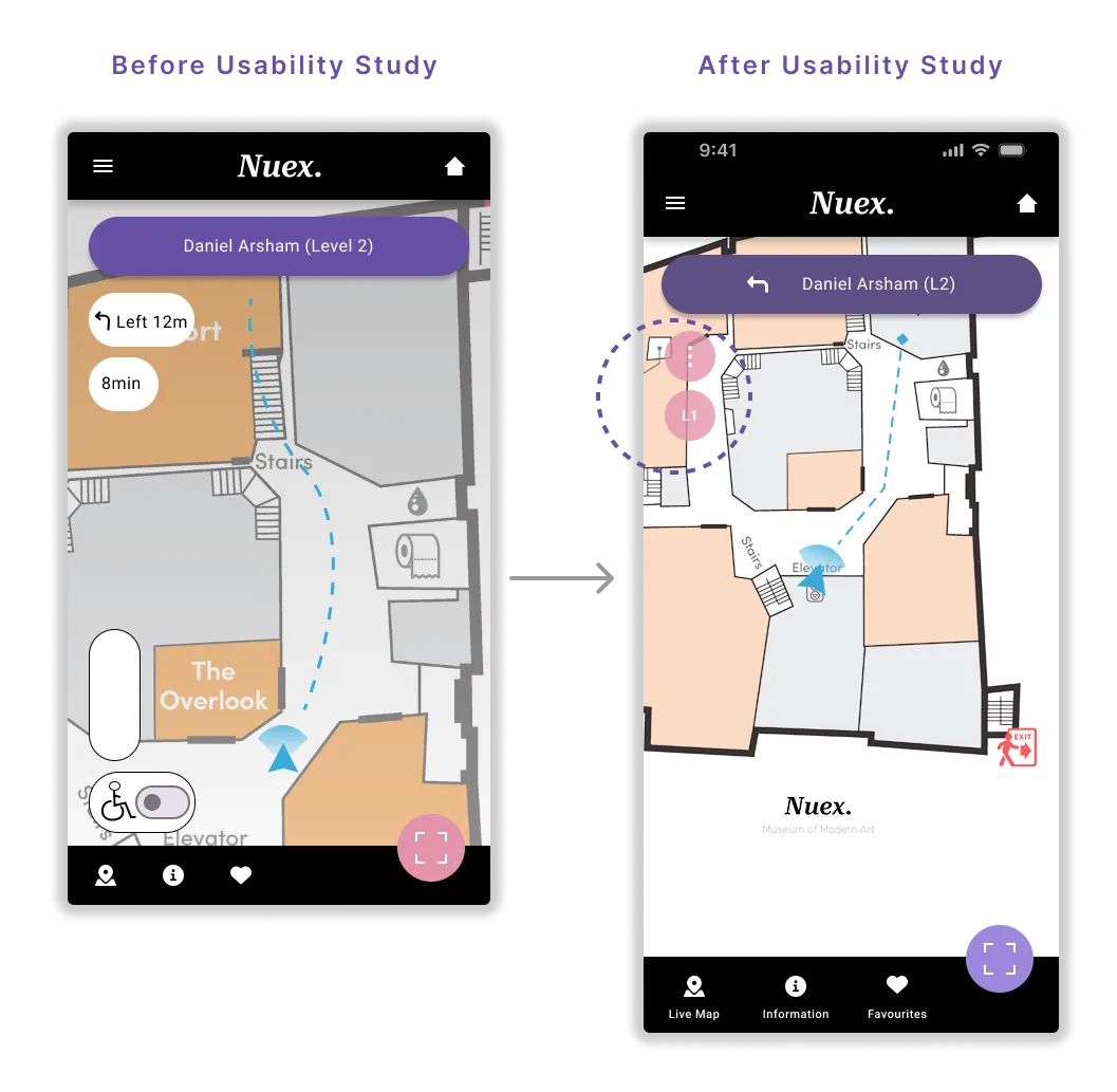
Two rounds of usability studies were conducted. Findings from the first study helped improve the design usability by addressing the key pain points of users. The second study focused on refining the high-fidelity design aesthetic and optimising the user journey within the app.

Some users could not identify the navigation icons purpose (Map icon) - Icon labels will be added.

When using the map feature users wanted to be able to toggle between levels in the museum with ease.

Users wanted to be able to download the Art information to read off the App at a later time of convenience.

The results from the usability study are then implemented into the design. At this stage branding and colours are also implemented.
A logo was created to fit the brand identity of the art museum, whilst fitting small applications and one colour styling.
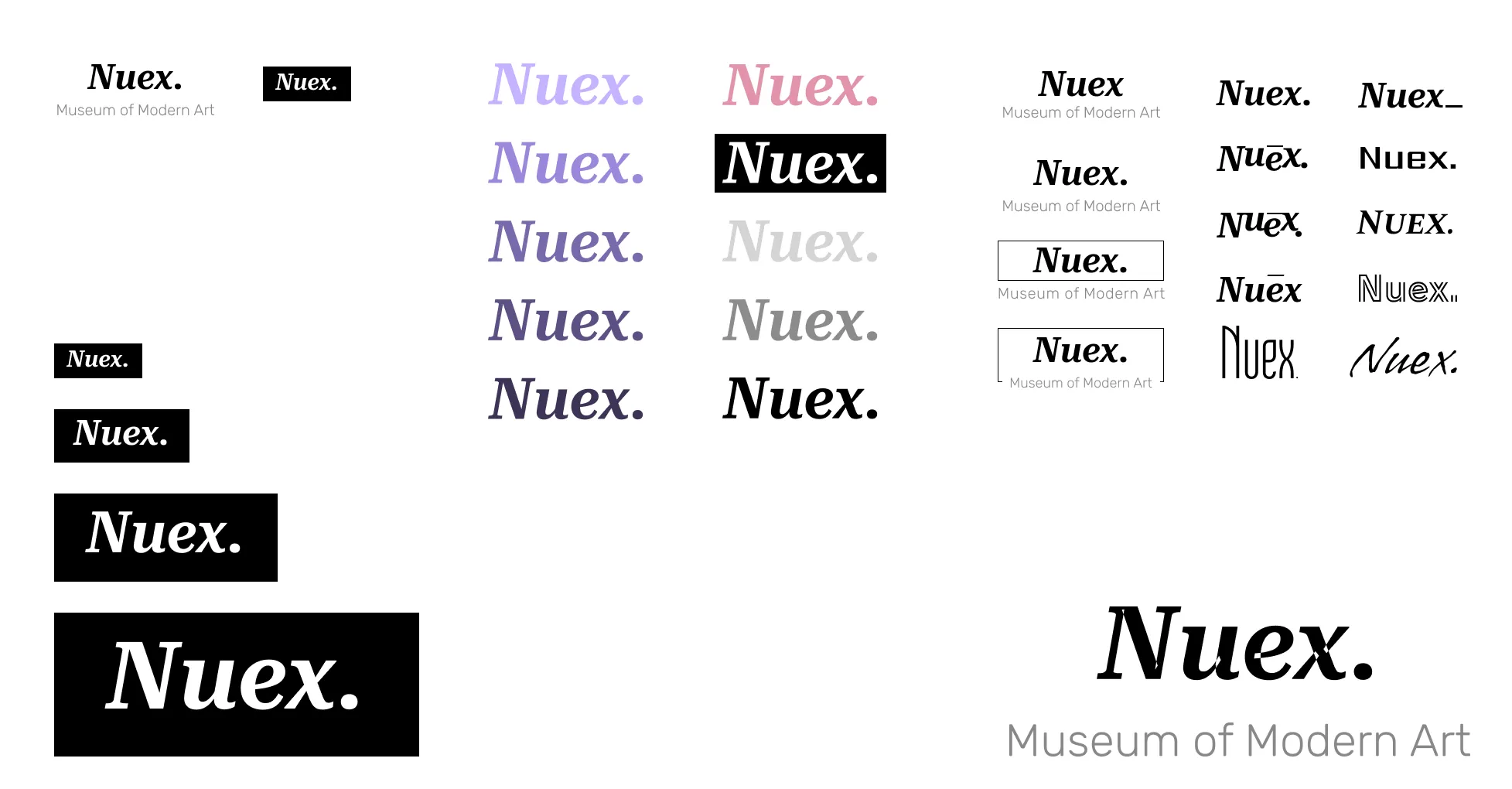
A colour palette of primary, accent and neutral colours was selected and created into styles within Figma for uniformity and brand guidelines. Font families were also created into styles for the design system.

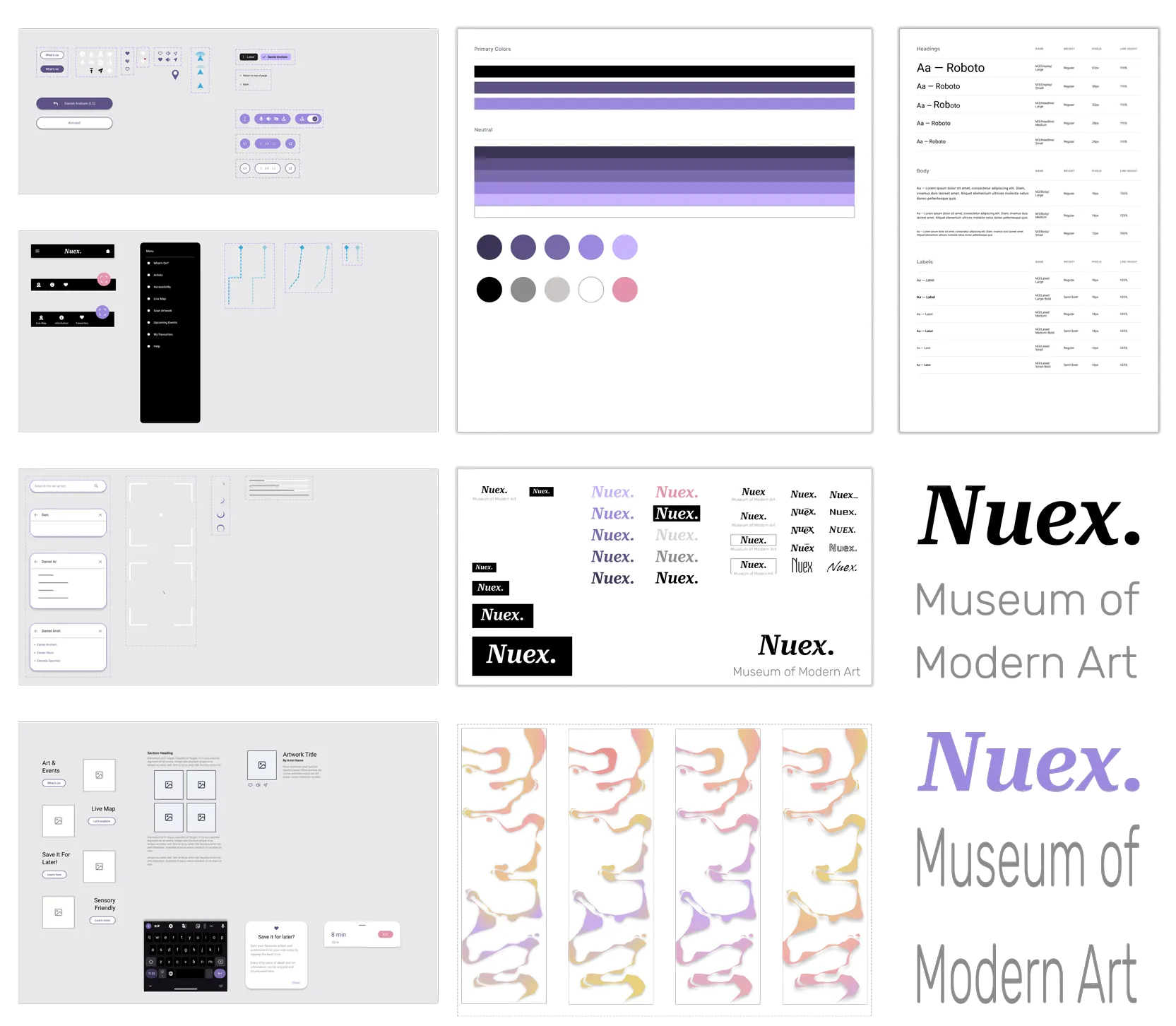
Colour, branding and imagery added to the prototypes ready for users to test and experience the product without guidance.
All screens and colour styles within the product adhere to AAA colour contrasting standards meaning an extremely high level of contrast has been achieved and the content should be readable for the vast majority of users.

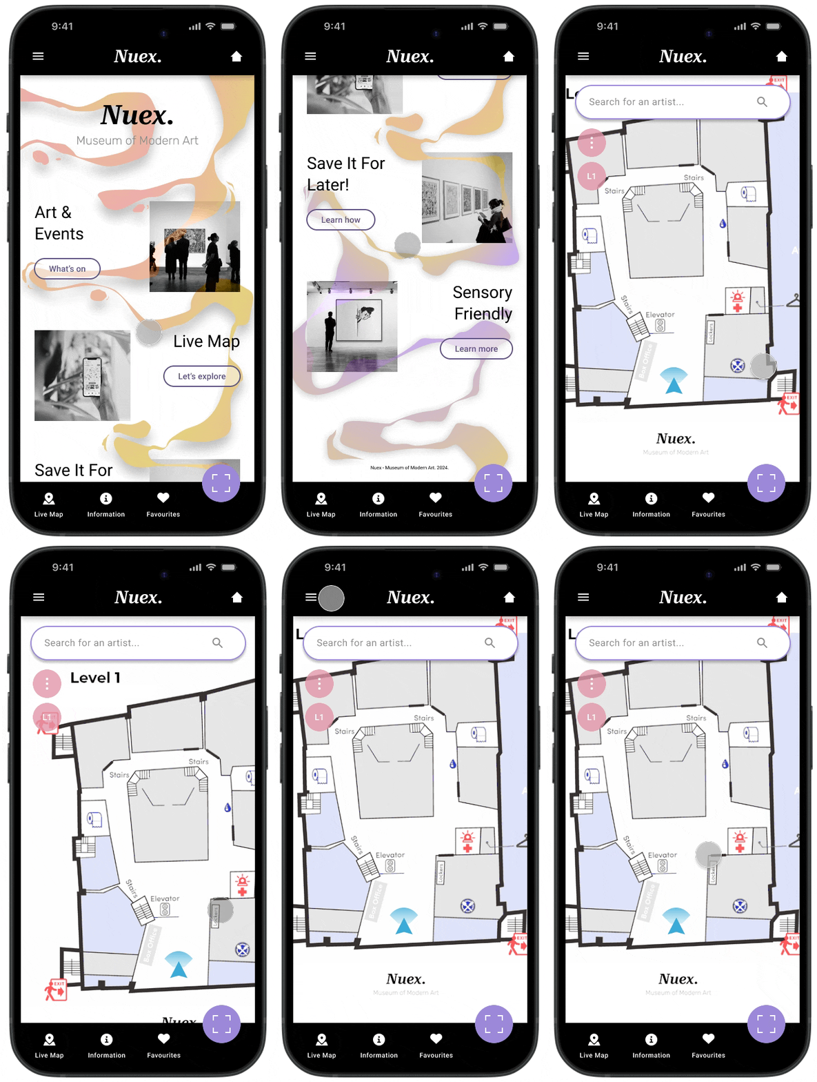
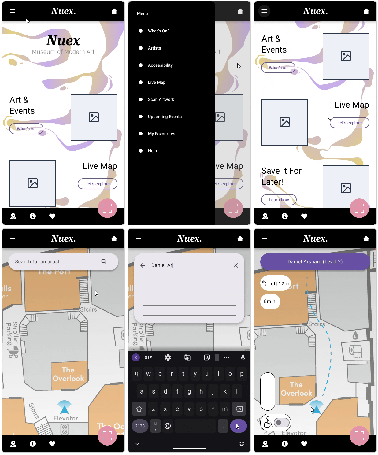
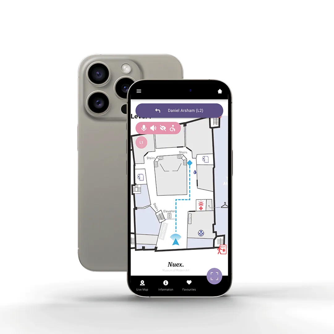
Home screen and map navigation screen. Patrons of the art museum can pan around the map and click on an exhibition or use the search feature to locate desired works with ease.
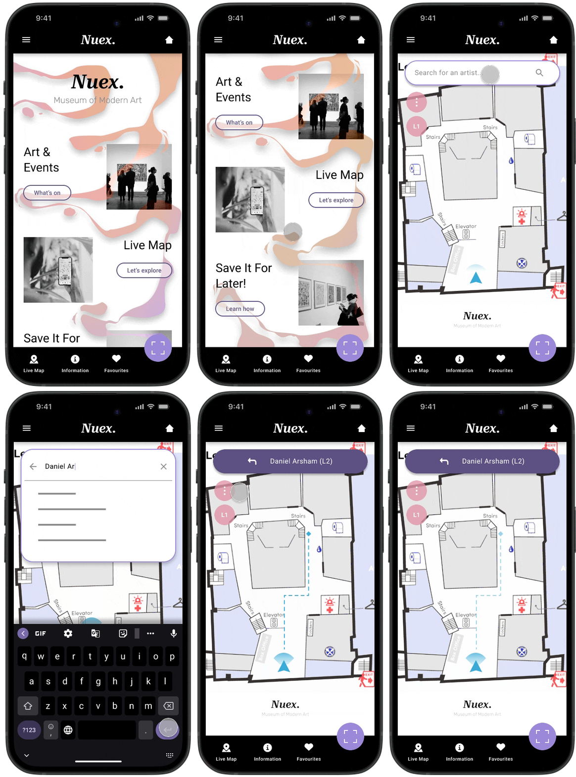
Searching for an artist inside the map feature to get clear directions and an accurate walking estimate.
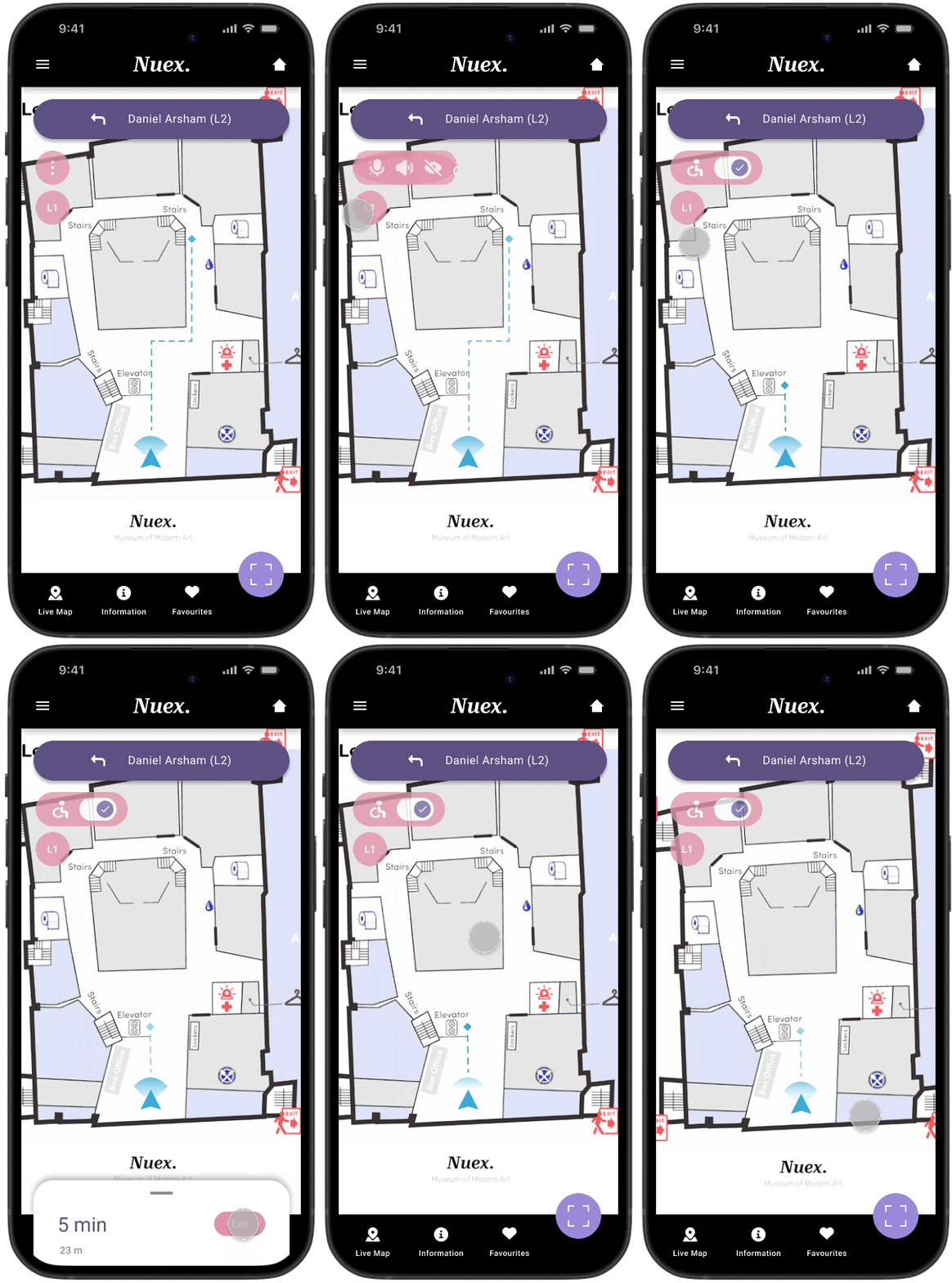
Accessibility mode - for those who have difficulty with or are unable to use stairs. This feature re-routes the wayfinding system to avoid stairs and provides an updated time estimate for the user.
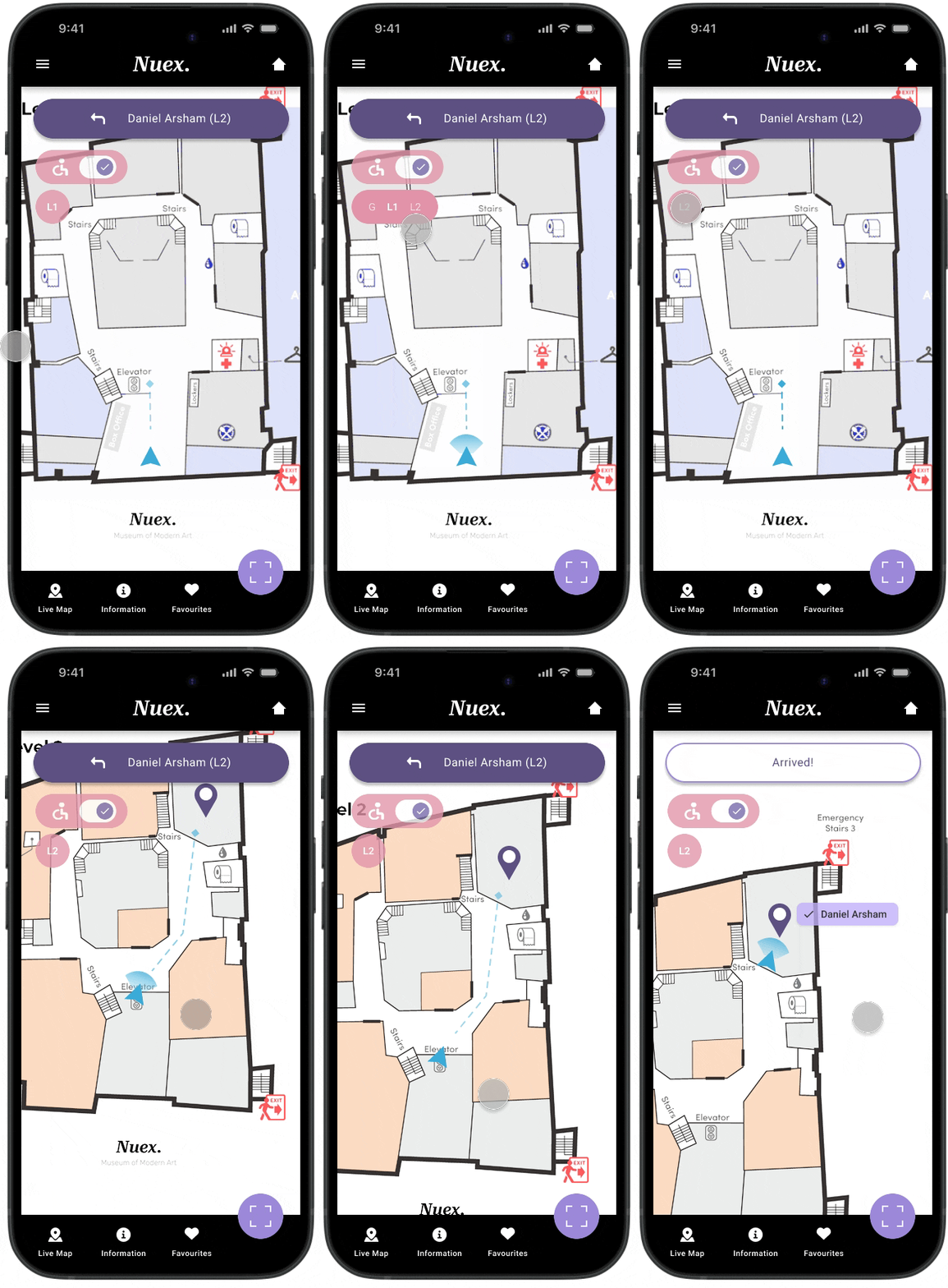
Toggle between levels of the museum using the pink expandable level selector button. When the button isn't in use it remains in an opaque state to avoid interfering with the map underneath. Each level of the museum has also been colour coded and labelled for improved usability.
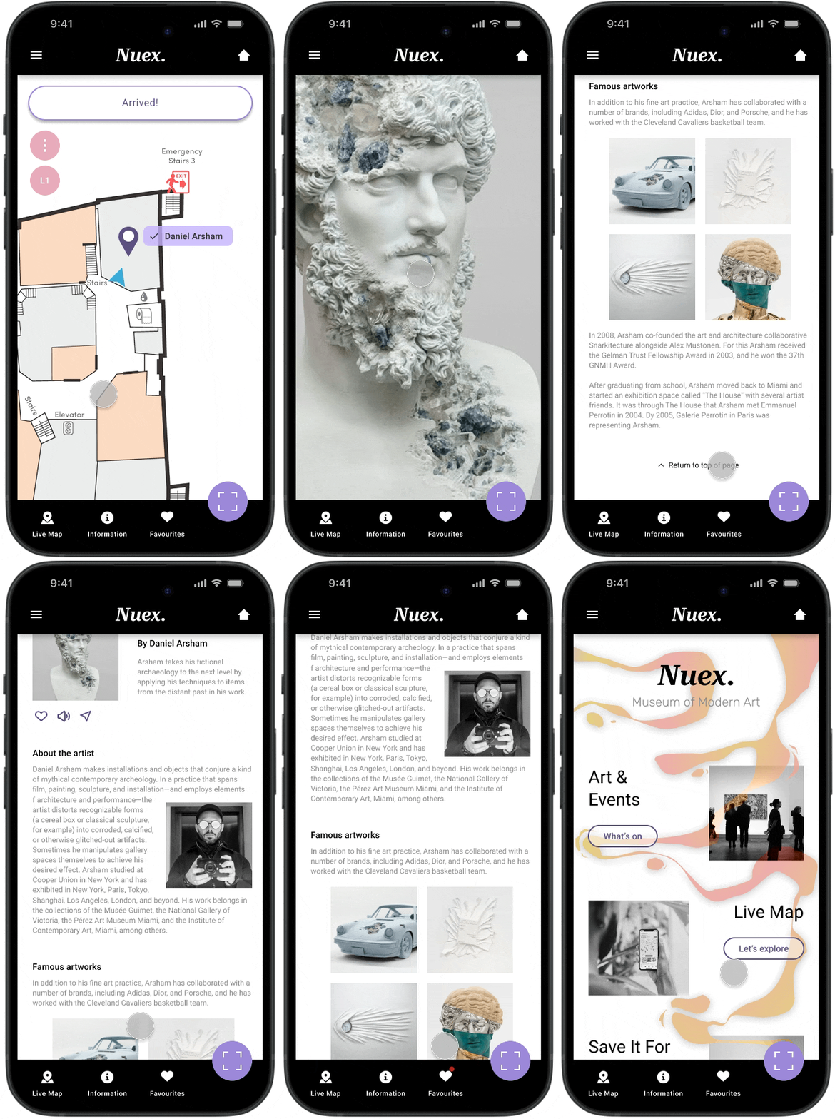
Once arrived, the user can use their phone camera to scan the artwork they would like more information on. An artist detail page will then load which can also be favourited and saved for reading later.
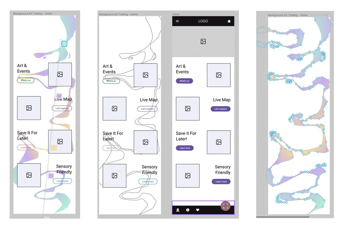
Considering the product is for a modern art gallery I decided to have some fun and create a custom background graphic for the home screen that makes users remember it. The graphic is subtly animated with a changing gradient and shadows.
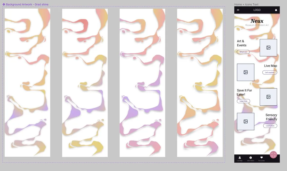
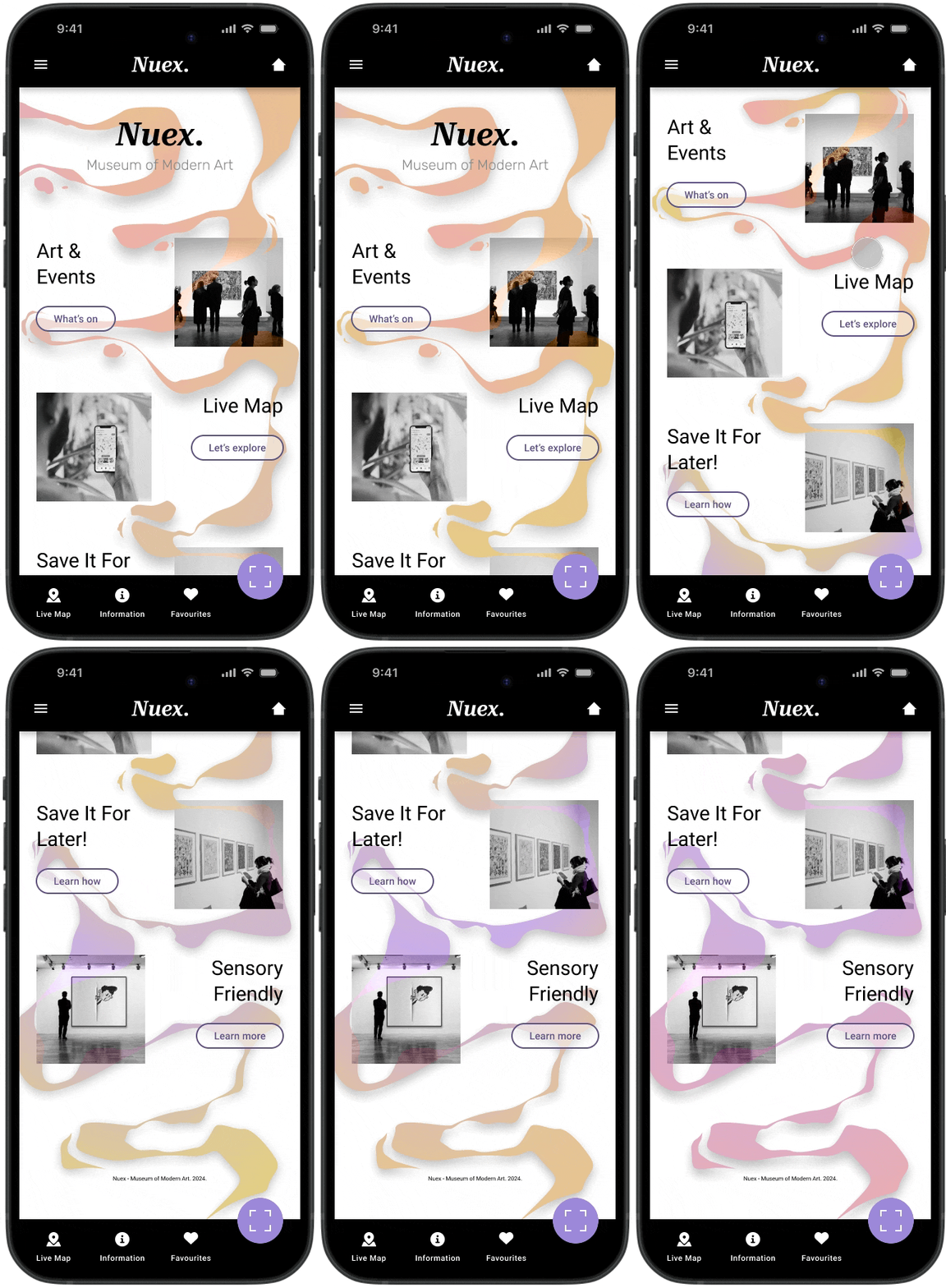

The map features a panel of accessibility settings which alter the navigation path to suit the users need. For example if a patron uses a wheelchair the map will update routes and avoid stairs.

All information can be played out loud or screen read. Catering for those with reading or vision disabilities. This is also helpful for able user who wish to listen to the information through headphones as they explore the museum.

I am only using two typefaces that are both sans serif fonts. This improves overall legibility of the content. The type and body colour selection also has AAA rated contrast level.
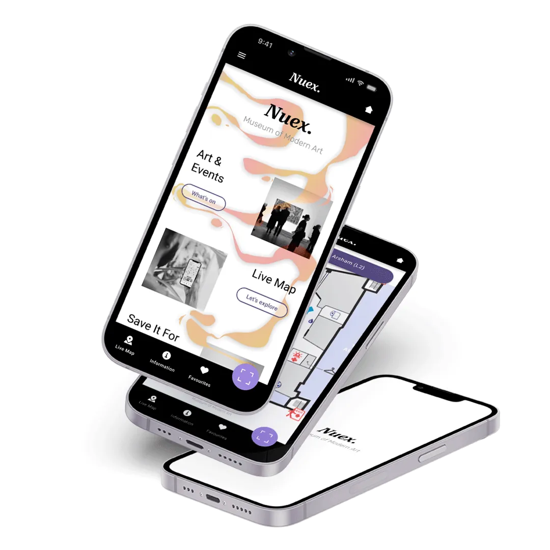
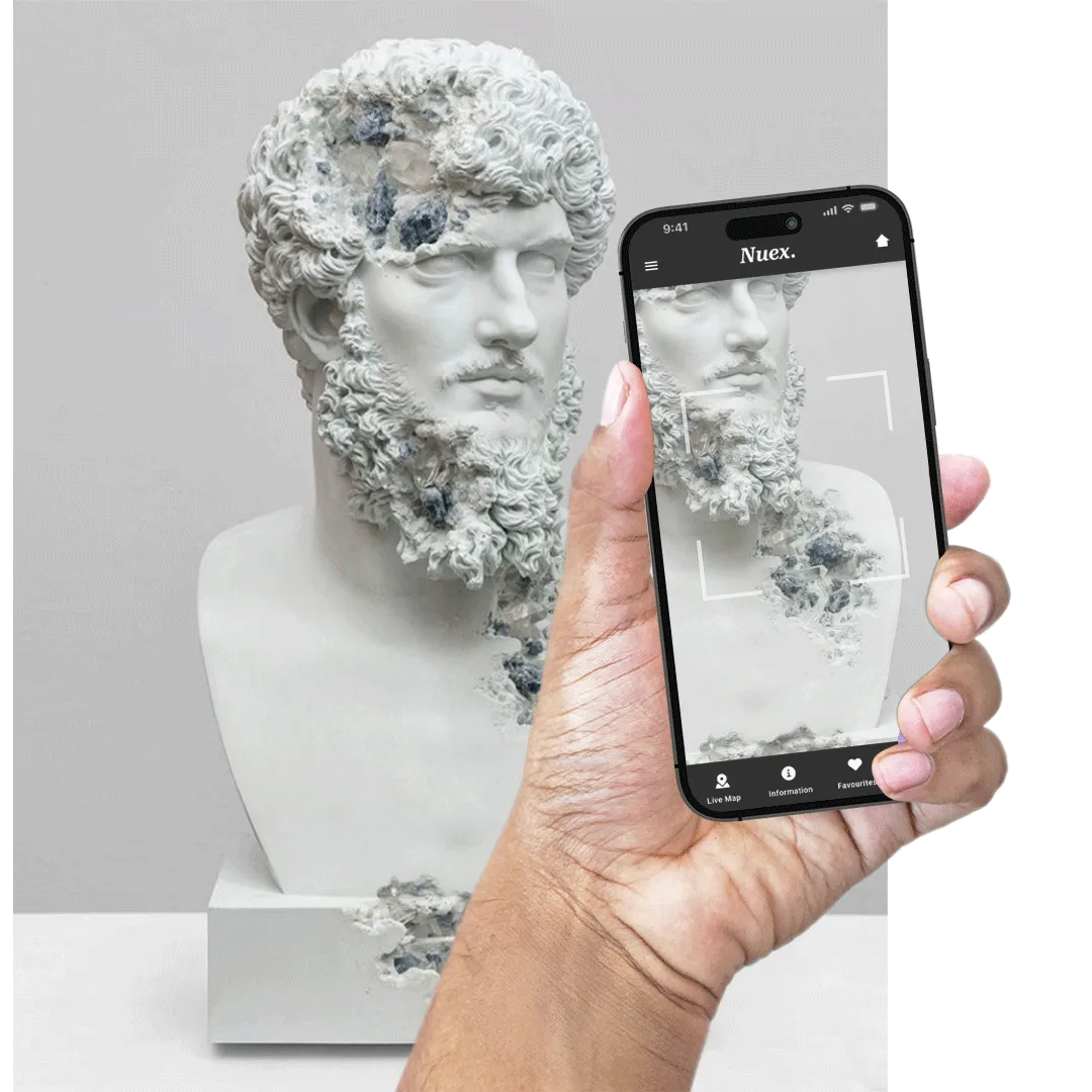
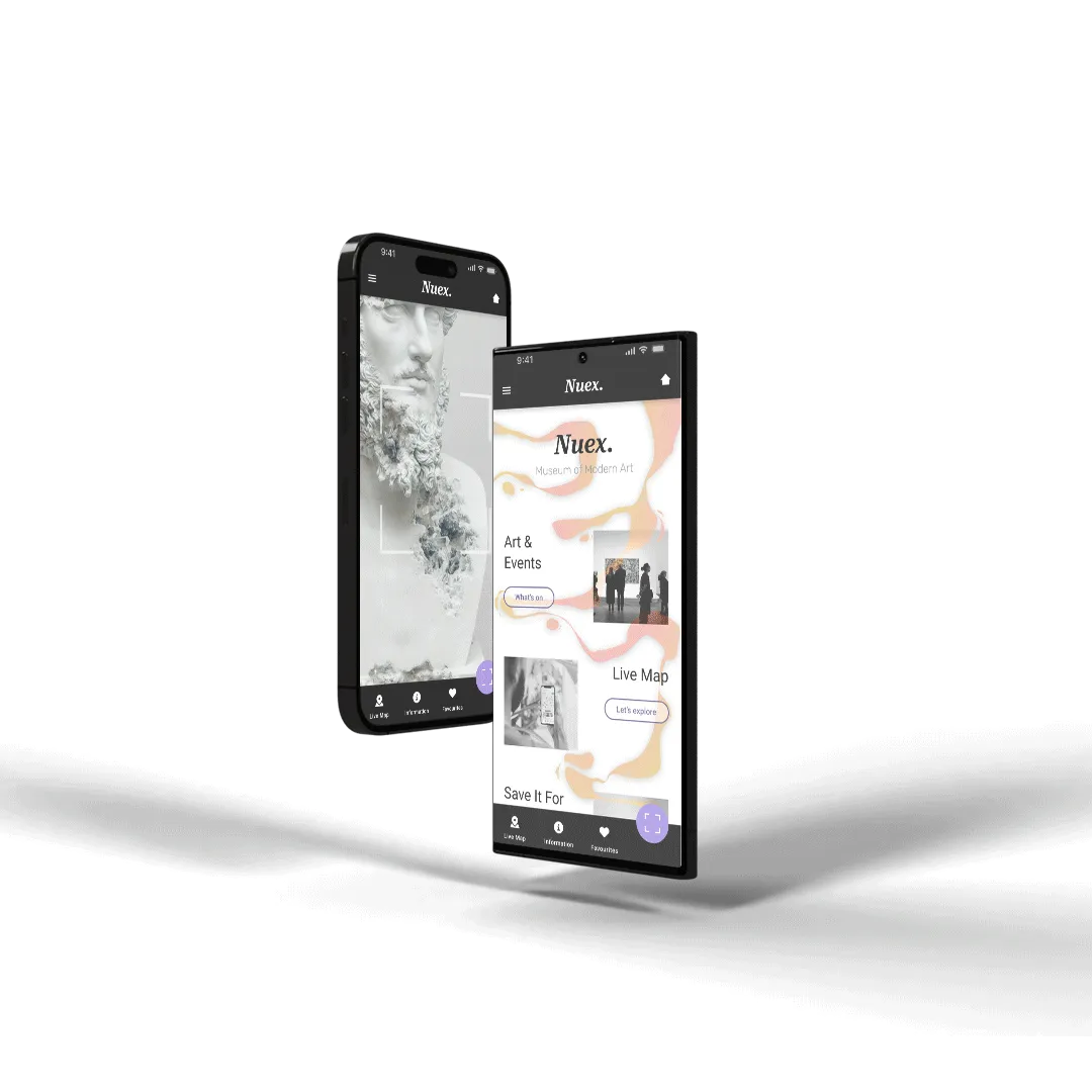
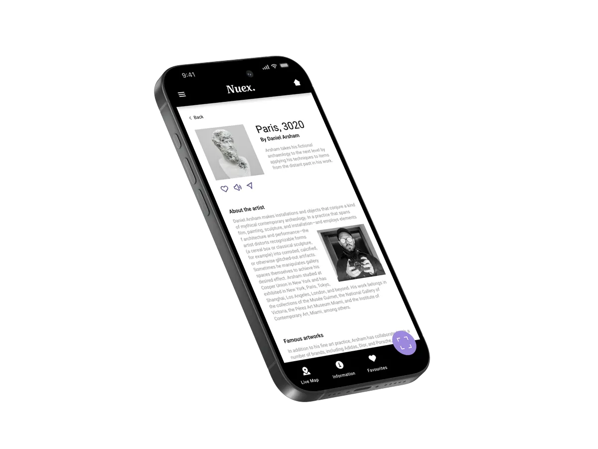
The new app has drastically improved the customer experience and wayfinding at Nuex - Museum of Modern Art. Museum patrons can now efficiently navigate their way around and not miss any of the exhibitions they came to see.
Artist details and information can also be saved for later saving the user even more time to roam and enjoy the museum.
I appreciate the time taken to look through my work. If you want to get in contact hit the 'SAY HI' button below.