Client
Blizzard Snow Gear
My Role
UX / UI Lead - Designing a mobile and responsive web app for Blizzard Snow Gear retail store from conception to product delivery.
Project Duration
October - December 2023
Skills
Responsive Web Design, Customer Surveys, Wireframing, User Research, Prototyping, Usability Studies, Refinement and Design Systems

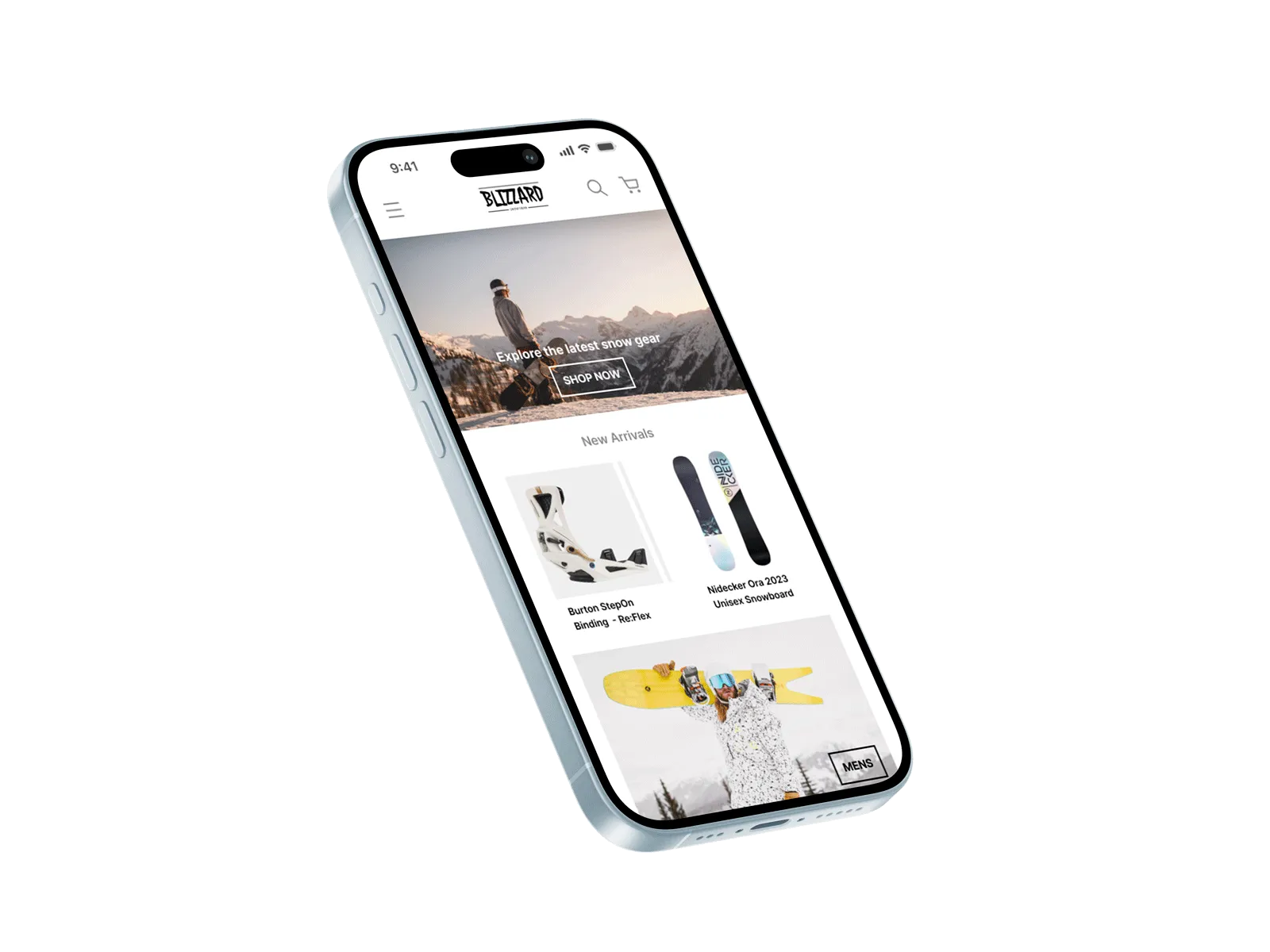
Blizzard Snow Gear is a snow supply store that requires a mobile app and responsive website. The small business based in Colorado want a refreshed look and feel to their currently very slow and clunky website which has been deterring customers from making purchases. Customers would also like details on product stock before going in to the store.
This is case study project was created during a Google UX Design Academy Course.
A sample group of customers were each provided with a short survey to further understand the user pain points. The findings from the customer surveys lead to the creation of user personas, the personas embodied the diverse range of customers whilst highlighting common frustrations.

The user research group concluded that product inventory was an issue. Many customers arrive at the store to find their desired style or sizing is actually out of stock. Customers also found it hard to get staff help in store or experienced long order queues. A webapp that provided accurate inventory, sizing and guidance would drastically improve the experience.
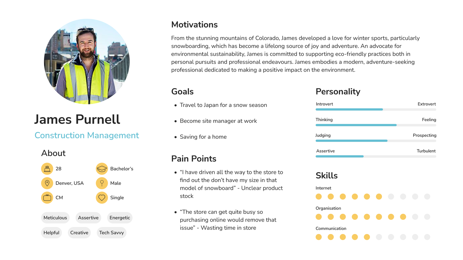

Users experience frustration when they visit the in-person shop to find the product they wanted to purchase is actually out of stock.

Many users are busy and time poor. This makes visiting and spending time in the store a potential obstacle to a sale.

Customers can feel over-whelmed and often want more details (especially sizing) on the item they are interested in before purchasing.
Customers want an efficient purchasing experience. Currently the availability of products is not clear and the wait at checkout is too long .
Display specific product details such availability and sizing whilst making online shopping efficient to avoid instore congestion at checkout.
With the user, pain points and goal defined the design process can commence.
SITE MAP // WIREFRAMES // LO-FI PROTOTYPES // USABILITY
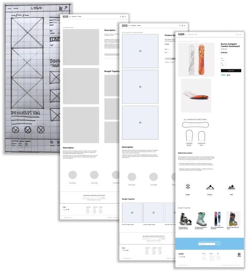
A site map was created to layout the required pages and understand page hierarchy based on the users needs. The information architecture helped define the location of content and further understand common click paths and user journeys.


Initial paper wireframes were created for each screen of the website to ensure the layout addresses the users common pain points whilst prioritising usability and aesthetic UI elements. For example a consistent navigation and button shape has been implemented.
The primary user flow identified - Purchasing an item.
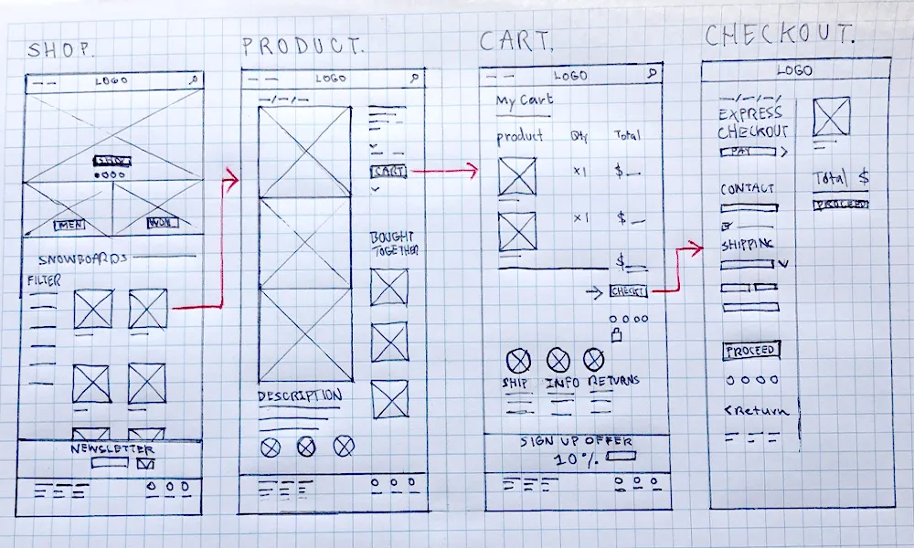
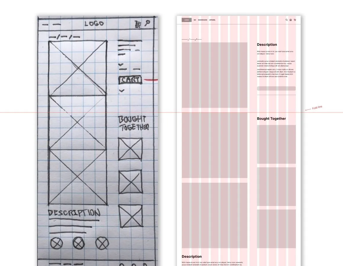
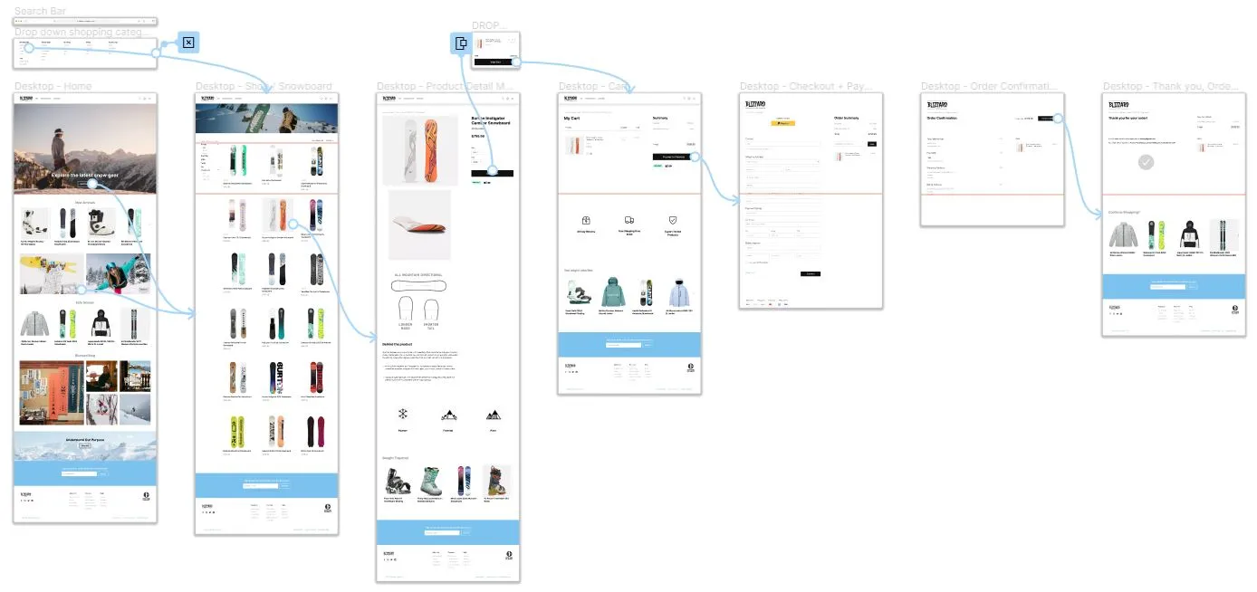
Digital wireframes organised into a refined user flow for purchasing an item online.

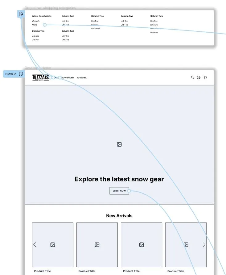
A menu drops down on hover to provide customers with detailed selection whilst reducing clutter in the top navigation bar.
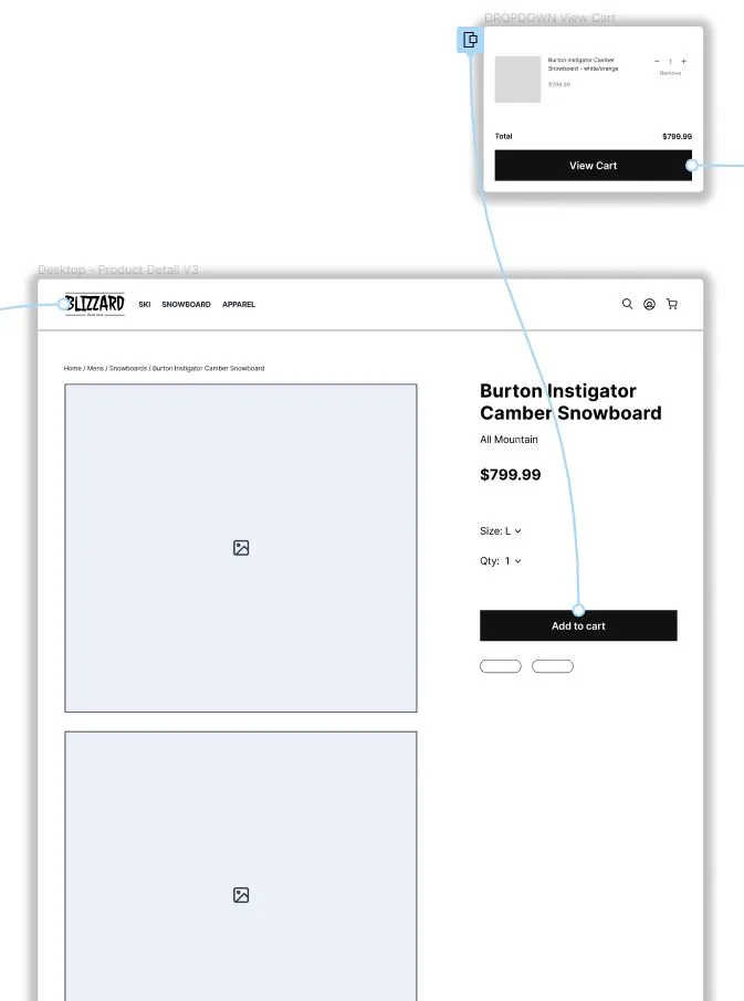
A 'View Cart' overlay slides down when an item is added to cart. This encourages and automates a faster checkout experience, resulting in less items abandoned in cart.
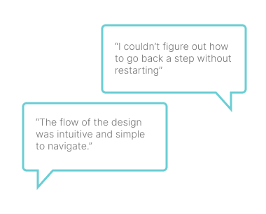
The lo-fi prototype was sent to 5 participants along with a set of tasks to complete within the product. These tasks included:
- Purchasing an item
- Changing sizes of an item
- Reviewing the fluidity of the design
- Reviewing the overall intuitiveness and usability

Unmoderated study

Australia, remote

5 participants

20-30 minutes
Two rounds of usability studies were conducted. Findings from the first study helped improve the design usability by addressing the key pain points of users. The second study focused on refining the high-fidelity design aesthetic and optimising the user journey within the app.
1 - Users want to be able to checkout faster and easier
2 - Some users wanted to go back one step without losing input detail in checkout
3 - Some users found the colour contrast harsh and text too small on some pages
4 - Button hover states added to encourage user flow
5 - Sign up footer with deal added to all screens
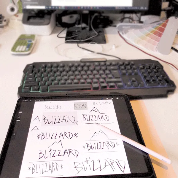
A Logo design was created using freehand ipad sketches in conjunction with Adobe Illustrator and Figma. The hand drawn style achieves a fitting and unique look for the brand identity.
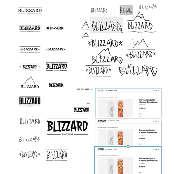
How does the logo align with the brand identity?
Requirements:
- Wordmark
- Minimalistic
- Adaptable (Web and print)
- Snow sports
- Performance
- Casual and energetic feel
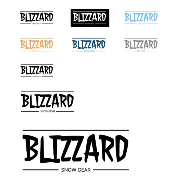
A colour palette of primary, accent and neutral colours was selected and created into styles within Figma for uniformity and brand guidelines. Font families were also created into styles for the design system.

Colour, branding and imagery added to the prototypes ready for users to test and experience the product without guidance.
The second usability studies refined UI elements and improved the efficiency of the order and checkout process. Considering the primary customers are busy and time-poor, optimising the user flow efficiency and time to complete were critical.
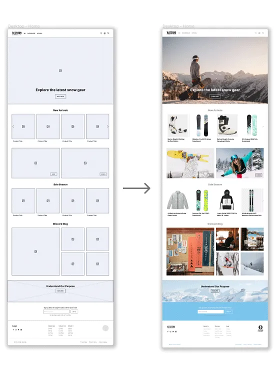
To the left shows the design development of the home page from initial wireframes to hi-fi mock up.
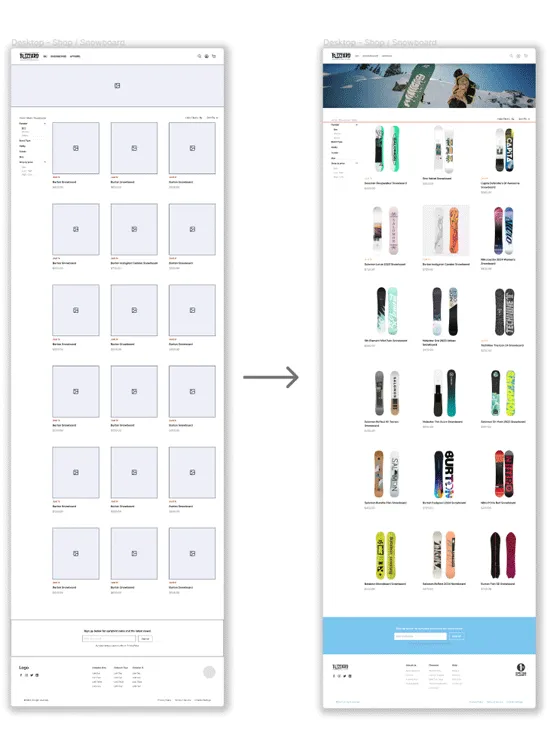
Shop - Snowboards page development. Banner hero image and coloured Newsletter CTA block added.

Confirm purchase page design development. Iconography and text sizing improved for greater visual hierarchy.
Prototype run-through, exploring the features added after the second round of usability testing to optimise the experience.
Hover states added for a greater sense of interaction and for the user to understand which label is in the cursor target area for clicking.
Carousel product sections included for user suggested products, allowing fast product selection from the home page.
Social media tiles provide text description on hover to allow a clean image grid with no text when not being interacted with.
Sub navigation or 'user click path navigation' labels added as a result of the usability study. This features allows for quick back and forth navigation between pages whilst visually notifying the user of their click path and current page.
Drop down selection list and view cart overlay - quick checkout features added for a fast and intuitive purchasing experience.
Auto fill and check boxes added in details page for a seamless checkout.
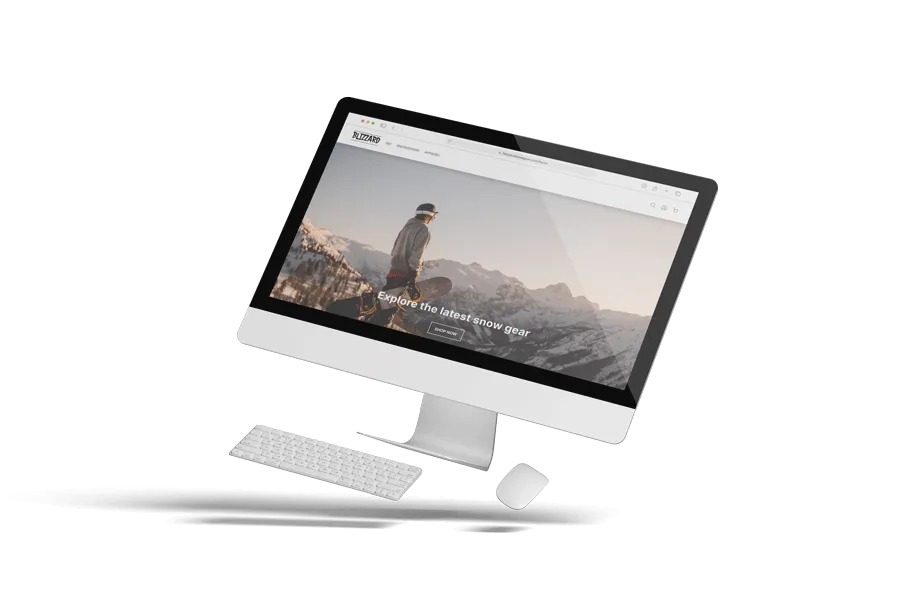
Next, the web app was optimised for other screen sizes, including tablet and mobile. This involved creating a collapsed hamburger menu, reducing the number of columns and shrinking content to fit whilst retaining aesthetic page margins and spacing throughout.
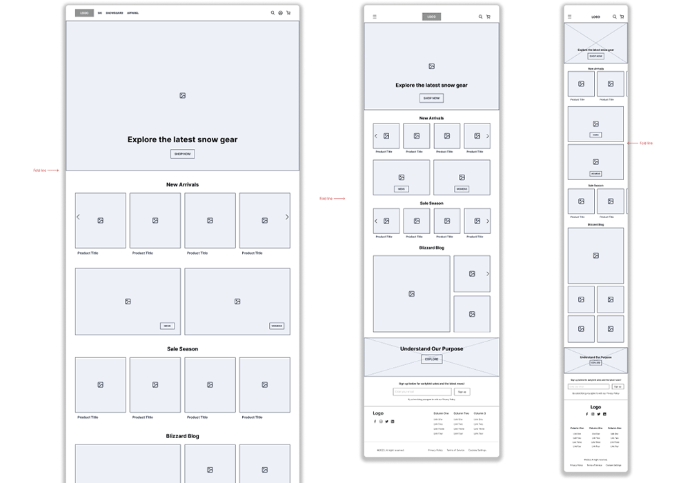

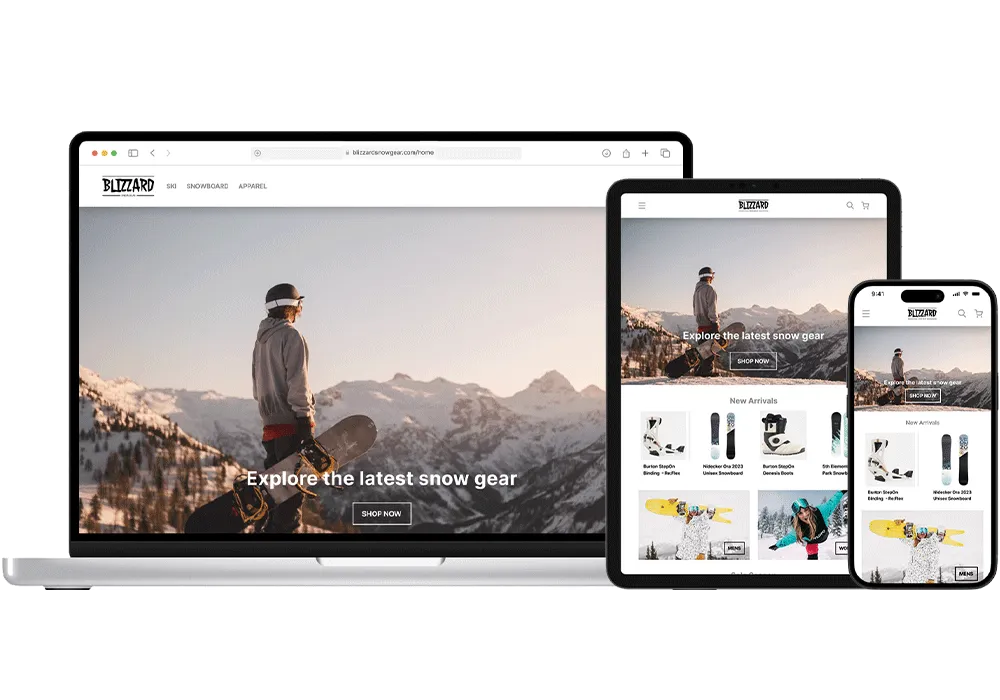
Prototypes displaying how the web app functions on tablet and mobile sized devices.
The mobile version of the web app utilises a hamburger menu, product image carousels and stacked grid formats. This reduces the screen real estate used and still provide all the same information as a larger display.


The tablet sized display also utilises a hamburger menu and image carousels. However, this screen can fit multi-column grid stacks without compressing images and text to an illegible clarity.

When choosing a colour palette, I made sure my primary colours met WCAG and AA Compliance before building out the UI for each screen.

A text hierarchy with annotations guides the screen reader through the content in the correct order.

I am only using two typefaces that are both sans serif fonts. This improves overall legibility of the content.
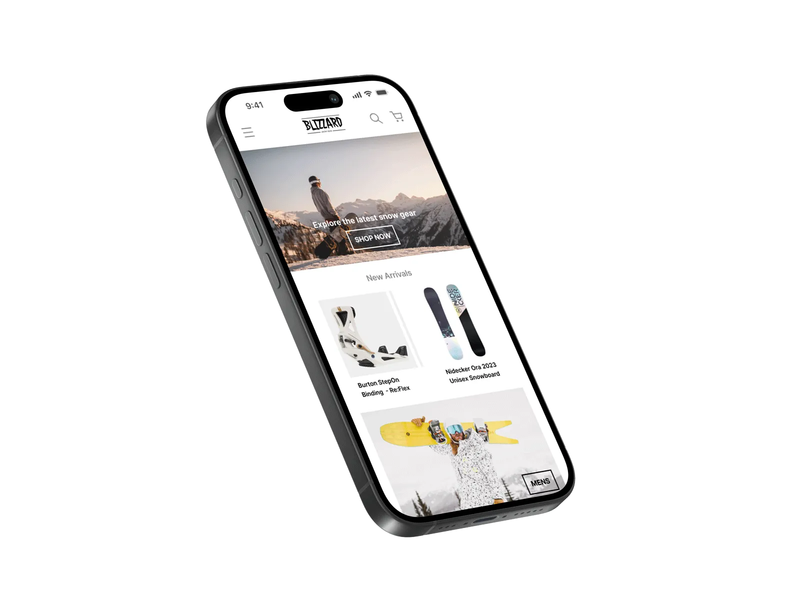
The new mobile app and website has improved customer satisfaction and reached a new group of digital consumers. Ultimately boosting the snow stores sales and return customers. Potential customers are now aware of the product inventory in each store before arriving for pick up. Customers that are purchasing online now save time and efficiently browse through options using the digital filters.
I appreciate the time taken to look through my work. If you want to get in contact hit the ' SAY HI' button below.